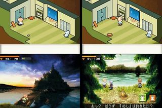
It's as radical a rationale for DS's twin screens as has been attempted yet but, once in control of Cherry, things take on a much more conservative air. Control works either with the D-pad or the stylus, both of which work well, and there are chests to find, bosses to defeat and shortcuts to uncover.
Combat is automatic - a little similar to how some MMOs work: approach an enemy, select your attack stance and watch while you trade blows. Your tactical input comes from selecting special attacks, deciding if it's time to run away, and using the game's other big DS-inspired idea: seals.

Above: The lush, organic 'realistic' world view is inspired more by oil paintings than clinical pixel art
These are extra-special moves, perhaps allowing you to summon an ally, handle dangerous material or unleash a particularly powerful attack, and must be peeled like a sticker out of your seal book, and then stuck down over the action where you need them - all with a swipe of the stylus. This feels a little clumsy in the preview code - as do a few other elements of the game - but there may be time to address this before a European release.
So, aptly enough for the use it makes of the two screens, Contact is looking like being a game of two halves. The set-up and presentation are as high-concept as they come: technically impressive and genuinely imaginative. But the meat and potatoes of the gaming - in the initial stages at least - are just that. A longer test will be needed to see if the two balance each other out, or tear the game in two.
Sign up to the 12DOVE Newsletter
Weekly digests, tales from the communities you love, and more
Most Popular


