Concept art appreciation - Persona 4
A closer look at the art in and out of the Midnight Channel




























Henry Gilbert is a former 12DOVE Editor, having spent seven years at the site helping to navigate our readers through the PS3 and Xbox 360 generation. Henry is now following another passion of his besides video games, working as the producer and podcast cohost of the popular Talking Simpsons and What a Cartoon podcasts.
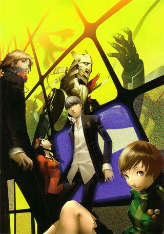
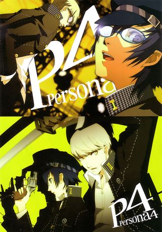
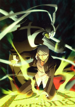
Welcome to concept art appreciation, our new semi-regular feature that pays tribute to some the best work done by the artists behind the scenes. Before the developers can start building people out of polygons, the characters and worlds within a game need to be defined on the page by an artist. Some select games feature art so gorgeous that you just have to stand back and appreciate it outside of the game, and that’s certainly true for…
Game: Persona 4
Artist: Shigenori Soejima
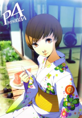
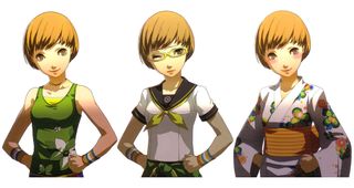
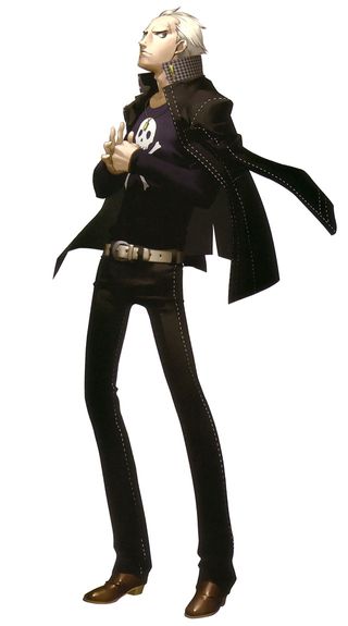
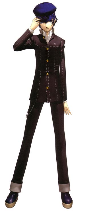
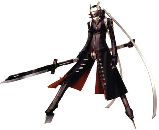
Soejima has been the designer on the Persona series since the first game in the series launched on the PlayStation, and he did some of his best work as the art director on Persona 4. Compared to previous entries, P4 lightened the mood, added more unassuming protagonists, and had a much more everyday setting than Persona 3. Despite those changes and constrictions, P4’s cast was distinct, and the town of Inaba was one of our favorites in recent memory.
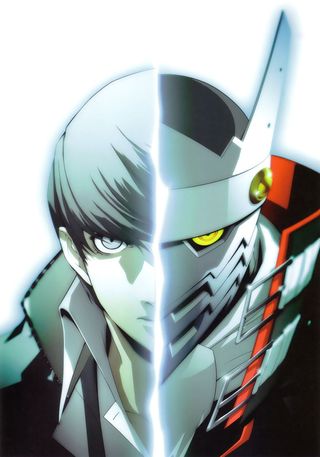
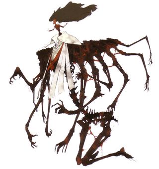
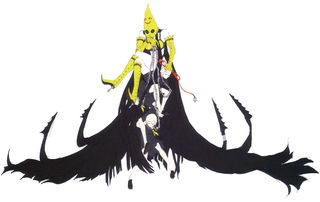
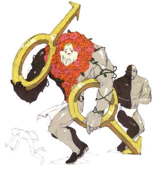
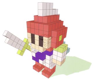
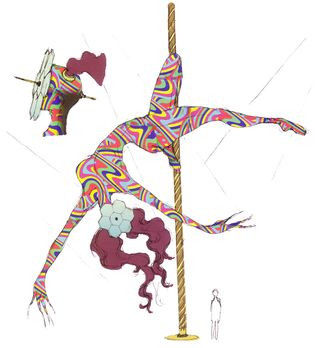
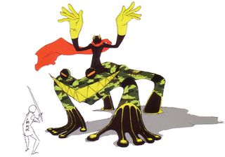
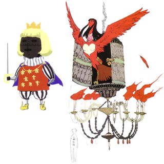
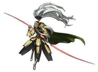
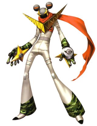
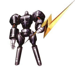
In addition to the normal demands of character and world design, Soejima and the other artists on Persona 4 put a ton of effort into designing the many Shadows and Personas that were integral to the game’s deep story. Each of these had to express some telling part of the character’s personality that was hidden deep within. Both the art and writing deserve praise for crafting such strong characters--each new Shadow/Persona you come across feels simultaneously like a surprise reveal and a natural extension of a character, and that’s all evident in the concept art.
Soejima and the rest of Atlus’ design team also found interesting ways to incorporate bright yellow throughout their work. The color is immediately eye-catching, partially because so few games use it as a dominant color, but the art team made it feel natural without detracting from the reality of the world.
If you want to see more of Shigenori’s work, you can see severaltranslated versions of his art books on Amazon. And of course, be sure to play Persona 4: Golden on PS Vita to see his most recent work in motion.
