Classic game appreciation section: Soul Calibur
A tale of souls and swords, eternally retold
I say 'welcome back', because while we're used to numbered sequels to this, the original SoulCalibur, the game was itself a sequel to arcade/PSone beat-em-up Soul Blade - a game that's equally worthy of praise for its true 3D backgrounds and fights that actually looked like two people having a scrap.
But that was the previous generation and, in 1999, gaming technology was taking vast, continent-sized strides forward into the next generation. Call it providence, but everything fell into place to create the perfect conditions for the birth of something extraordinary.
The impressive and meaty fighting engine of PSone's Soul Blade just needed a few tweaks to really shine. The dawn of the128-bit era allowed developers to draw characters and environments in full 3D with no compromises. And, crucially, the series was still young enough to feel fresh and new. Everything was set for a classic - and boy, did we get one.
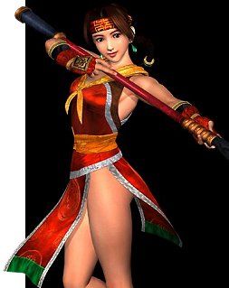
Speaking of fresh and new, just look at Seong-Mina here. Her eyes aren't crossed like they are in the first sequel (I'll never forgive you, Namco), and her skin is flawless. She's beautiful. Perfectly proportioned and exquisitely programmed to fit in with her surroundings.
Wild Thing, I think you move me...
But graphical quality would be nothing without great movement – something that Soul Calibur still excels at. It's hard to think of any fighting game that moves better. Just watch as Kilik here goes through his repertoire. It's so solid, so assured… such a wonderful exhibition of technology married to skill. And there's no hint that this game is 12 years old, it's still on the very cutting edge of videogame animation, right down to the leaves being blown about the floor by the air displaced by Kilik's movement.
Problem was, the standard was set so high by this launch title that nothing else really matched it until PS2/Gamecube's era began. Sure, we had Dead or Alive 2, which is just as fluid but lacks detail in comparison. And even moving away from sheer technical ability, the art design of SoulCalibur was unmatched by anything in the last generation.
You can feel the air around Siegfried's castle and the warmth from the glowing orange sunset behind Cervantes' ship, which casts shadows on the floor under the fighters. Taki's temple stage looks amazing, with a statue in the background so detailed, it could easily pass as a playable character.
Sign up to the 12DOVE Newsletter
Weekly digests, tales from the communities you love, and more
Then there's that Venice stage, with architecture so magnificent, it single-handedly shrugged off the entire 32-bit generation like some tatty poncho it used to wear before it discovered silk robes. It made everything that came before look ragged, jagged and (to put it as eloquently as possible) a bit crap.
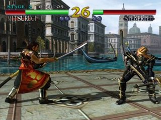
Above: This screen's from the XBLA version, BUT THE GEOMETRY STILL BURNS
With these beautiful characters in their incredible surroundings, it's little wonder my gran asked me whether the people were real when I showed her the game my parents had given me for Christmas that year. I can understand her confusion – the images being displayed on my 15-in TV were far too fluid and detailed to be a cartoon, yet too stylised and extraordinary to be a video. They do look like actors. But then she had a go and realised just how brilliantly interactive this stunning experience truly is.
Justin was a GamesRadar staffer for 10 years but is now a freelancer, musician and videographer. He's big on retro, Sega and racing games (especially retro Sega racing games) and currently also writes for Play Magazine, Traxion.gg, PC Gamer and TopTenReviews, as well as running his own YouTube channel. Having learned to love all platforms equally after Sega left the hardware industry (sniff), his favourite games include Christmas NiGHTS into Dreams, Zelda BotW, Sea of Thieves, Sega Rally Championship and Treasure Island Dizzy.
Most Popular


