No budget, no rules: the 10 most original indie art styles
All the pretty games!

One of the best things about indie games is their penchant for originality. Whereas AAA titles are often cut and dry, being forced to conform to what the masses like to see, indie developers have more freedom. Want to make a game where you're a border patrol agent? Sure. A cube? Why not? This applies not only to gameplay, but visuals as well.
The ten games on this list specialize in that last point. The art styles of these games left a mark on us from the second we started playing, whether they present something brand new or hearkened back to gaming's yesteryear.
Braid
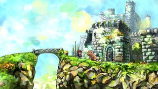
The world of Braid looks like the work of a master artist, capturing a frozen moment in time with his brush and paint. Trees and other foliage grow in all directions, the sunny sky is capped with a few clouds, and that's just the first level. Colors swirl throughout the terrain, lighting up whatever screen we're playing on in a manner that's incredibly pleasing.
This choice in art is appropriate, as the "frozen in time" painting motif fits very well into Braid's time manipulation gameplay. Our hero Tim is searching for his Princess, a memory frozen in a time he can't recall. In order to find it, he must traverse these painted world and piece together the puzzles... literally. If Braid looked any other way, the story wouldn't have the same impact, but the painted style fits perfectly.
Fez
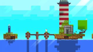
Fez's 2D-meets-3D world is amazing, one that still blows our minds every time we play. Watching the perspective of the world change with a button press, opening new paths to our objective--it impresses us every time. Come on, tell us you didn't sit there at one point and just shift the game world over and over again.
The game looks like an old NES title, which is cool in its own right, but the ability to manipulate the old look into something new is astounding. Shifting the world would often open new paths, too, something that merged the style and the gameplay brilliantly. We can't get enough of it, which is why we're really sad that Fez 2 is no longer coming. If there's something we can do to change that, let us know, because we want more Fez.
Limbo

Limbo takes place in a world where everything is black and white, but nothing is actually that simple. You're not sure where you are, you're not sure what you're doing, and you're not sure who or what is going to join you. There's a whole lot of grey areas, and it's your job to figure things out.
Sign up to the 12DOVE Newsletter
Weekly digests, tales from the communities you love, and more
The monochromatic visual style of Limbo adds to that motif, but it also represents a broader meaning. Limbo, for those unaware, is another word for Purgatory, or the area between Heaven (white) and Hell (black) in the Roman Catholic faith. Is this boy dead? Are we helping him find his way to either of those places, or are we just guiding him through the dangers of a dark forest in the living world? Limbo's grey areas make for a fascinating experience, enhanced by a visual style that is simply black and white.
Hotline Miami
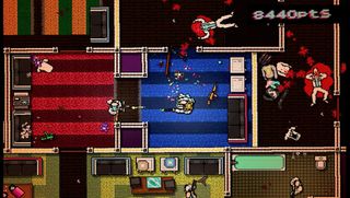
You might think we included Hotline Miami for its insane, over-the-top violence, but that's nothing new in video games. What we love about Hotline Miami is how it rips its style straight out of era in which it's set: electronic music, flashy colors, and neon EVERYWHERE. It's the perfect 80s homage wrapped in a blood-soaked ribbon.
For a while into the game, we're not sure why we're tasked with endless murder. Who's giving us the orders? What's going on here? We have plenty of questions, but damned if we don't love watching it play out. This art style pulls us in and leaves us feeling like we're on an acid trip. We hope we don't start hallucinating about men in animal masks... that wouldn't go over very well.
Minecraft

Is it 8-bit? Is it 3D? Minecraft is essentially both, bringing blocky graphics to an open 3D world. What's better, each of those blocks can be manipulated into whatever we the players desire, creating a virtual sandbox of endless possibilities. Minecraft, in a way, is the perfect time-waster, as hours can be spent building and creating whatever we desire.
Without the blocky look, we're not sure Minecraft would be as addicting as fun as it is. Sure, it's purely an aesthetic thing that shouldn't impact gameplay, but seeing those blocks gives us the ability to plan what we want to know. What fun would it be if we just dug holes in the ground and didn't know how far we were digging? Minecraft is a lot of fun, but a lot of that fun comes from the way it looks.
The Unfinished Swan

Like Limbo earlier in the piece, The Unfinished Swan is the story of a boy trying to find his way through a world of primarily black and white. However, where Limbo leans toward darker colors (and darker story elements), The Unfinished Swan sticks with white on white, allowing us to fill in our own black path by throwing balls of black paint and seeing where they land.
Sounds weird, right? Painting our way through this world doesn't make sense when you hear it, but playing it is a sight to behold. Just as a child discovers his way through life through trial and error, so too do we discover the world of The Unfinished Swan; we throw our black paint into the world and see where it lands. Later on, we get to play with colors as well, adding color to the monochrome world and creating a sense of discovery and wonder few games can emulate.
Ballpoint Universe

Remember all of those doodles you used to draw on the sides of your paper during class? How every math class became a experiment in art, depleting the ink in your pen faster than any class could ever accomplish? Well what if those doodles came to life and became a platformer-shmup hybrid indie game? That's what's happening here in Ballpoint Universe.
What makes this look so impressive is that it's not digitally simulated. Every line of this game is was handdrawn by someone on the development team. All of the characters, all of the stages, all of the animations, drawn by a human. That they were able to create an entire world based on doodling is phenomenal. We'd love to see their actual high school doodles...
Bastion
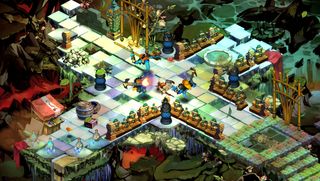
The players love watching The Kid fight his way through Bastion's Calamity-stricken world. The players marvel at the fact that even though this is supposed to be a post-apocalyptic setting... there was a Calamity, after all... the world's vibrant colors shine through. From The Kid's white hair to the blue-green hue of the Monument at the center of Bastion, this end of the world is a colorful one.
Bastion's art style is such a departure from normal apocalypse games that we can't help but love it. We can even add more color to the world as we progress by enhancing the hub, known as the Bastion, with buildings like a forge and a distillery. Bastion does a lot of things right, but changing the way we look at the end of the world is a landmark achievement.
To The Moon
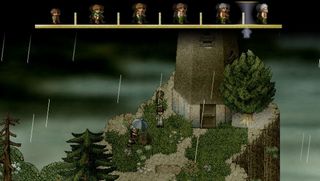
To The Moon rests its narrative foundation on the idea of memories. What do we remember? What do we try to forget? What about our memories do we wish we could change? While Johnny gets to have his memory eternally changed before he passes on, we in the real world are stuck with whatever memories we have.
What does this have to do with the art style? Well, To The Moon looks like a classic SNES RPG, specifically the Final Fantasys or Chrono Trigger. Everything looks like it was ripped out of our... wait for it... memories. Just looking at a screenshot brings back fantastic, nostalgic thoughts of a time of innocence, a time to which we wish we could return. Alas, we can't, but we'll always have our memories.
Journey
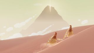
It's not the destination, it's the Journey. Thatgamecompany's 2012 masterpiece taught us to take things one step at a time, to look around and admire everything around us. Whether going it along or being joined by other travelers, the world should be appreciated for its beauty. Admiring the world of Journey definitely isn't difficult, as it sports some of the most beautiful visuals an indie game has ever seen.
The glistening desert, the snowy mountain, the shining sky... no matter where our Journey took us, we couldn't help but be overwhelmed by what surrounded us. Journey isn't a game to be rushed through, after all; every little detail must be considered, every landmark examined, every inch experienced. It's all a part of the Journey, and without taking the time to appreciate it, it'll fly by way too quickly.
A indie feast for our eyes
The best thing about indie games is that there's a ton out there to consider, so what did we miss? Is there a game we left out? Let us know in the comments, and we'll be sure it never happens again.
For more Indie Week goodness, check out 12 unsung games from indie devs you know and love and Ask an Indie Dev: What do you think about next-gen consoles?
