The best game covers of all time
Turns out you can judge a game by its cover

Once upon a time, videogame box artists carried a huge amount of responsibility. In the very earliest days of the medium, when even magazines didn't feature game screenshots, the cover art was your window into a different world – your best chance to understand the themes and gameplay concepts before you took the plunge and paid out your hard-earned money. If an artist could get this right, they'd often find repeat employment with one or more publishers. If they got it wrong, well, they probably still found repeat employment drawing the covers to Sega Master System games. Seriously, what was going on with those?
These days, with abundant video content available and the rise of digital game sales, box art isn't quite as important as it used to be. Still, we like to be positive people here at 12DOVE so we've decided to focus on 25 of the greatest game covers of all time. Sometimes these are purely for artistic merit, sometimes there are cool concepts or clever tricks that were only possible with printed paper, but all of them are fantastic. To save any arguments, we've listed these in roughly chronological order and remember – if you don't find your favorite here, it's still perfectly valid. Art is subjective, after all.
Defender
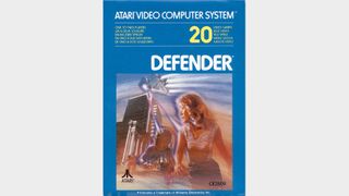
Back in the days of the Atari 2600, box art had to do a lot of heavy lifting. Given the primitive graphical capabilities of the console, most games relied on the packaging to convey the concept of a game, so Atari had artists producing some truly fantastic pieces for its games. This one might slightly oversell the idea though, as Defender's art looks like the poster for a cult Seventies sci-fi film with a real downer of an ending. It was actually a conversion of the arcade game designed by Eugene Jarvis, which was a fantastic but decidedly uncomplicated shoot-'em-up.
Super Mario Bros
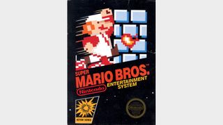
When the NES was introduced, Nintendo's iconic black boxes provided the most accurate representation of actual game content yet seen on front covers. For better or worse, nobody could accuse the company of being dishonest about the experience players would have, and in taking that approach it really created the first covers to truly celebrate in-game artwork. Many covers followed the template, but Super Mario Bros is naturally the most famous. We know this one will sharply divide opinions, but ask yourself one question: would it really have been imitated so often if it wasn't a classic piece of design?
Gradius
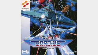
Japan has, via the anime industry, given us some truly iconic images of space battles. We're pretty sure that Konami's Gradius cover could hold up pretty well against any of them, as this is a highly detailed piece of art that really sells the scale of the forces that the Vic Viper is up against. The huge mothership provides a brilliant contrast to the smaller craft which are directly attacking, while the floating Moai heads provide some recognizable series iconography. This piece of artwork also appeared on a variety of other home versions of Gradius, including the NES and MSX.
Castlevania
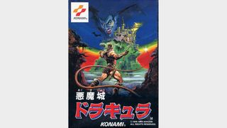
How often does a horror-themed videogame have artwork that looks quite so colorful? Looking out towards Dracula's castle and the dangers that lie ahead, Simon Belmont sees just about every shade of the rainbow. From the green mountain to the deep blue sky, where a visage of Dracula himself lurks, this somehow manages to defy the genre convention of relying on dark colors. The cover also manages to highlight one of Simon's key traits, with his trusty whip extending into the foreground, ensuring that he's ready to strike at any time. This art was used for various versions of the game.
The Legend Of Zelda
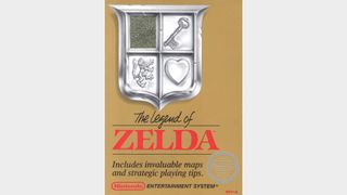
For a game as special and unique as Zelda, the artwork really had to be up to scratch. Nintendo delivered with a special gold box, prominently featuring a silver shield bearing three mysterious symbols. The presence of a missing piece in the shield not only created a sense of mystery but also allowed the player to peek through the box and see the special gold cartridge within. Breaking from the traditional look and feel of an NES game was a bold move, but it paid off handsomely for Nintendo, doubtless influencing the look of future Zelda covers as a result.
Sign up to the 12DOVE Newsletter
Weekly digests, tales from the communities you love, and more
Batman: The Caped Crusader
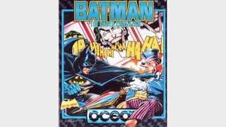
Bob Wakelin was a prolific artist for home computer games during the Eighties and Nineties, illustrating covers for everything from macho run-and-guns to cutesy arcade conversions like Rainbow Islands and The New Zealand Story. It's this piece that we're really taken with though, with Batman battling the Penguin as Joker cards suggest the looming threat of the Caped Crusader's greatest enemy. It perfectly captures the look and feel of Batman in that era – if it weren't for the publisher's logo, we're pretty sure you could convince most people that the art had come from a classic comic cover rather than a videogame.
The Secret Of Monkey Island

There's nothing like a classic LucasArts point and click adventure, and Guybrush Threepwood's outings are some of the very best the developer ever put out. The cover art here really sets the scene for a swashbuckling adventure, featuring classic pirate iconography with the central skull and crossbones flanked by a moonlit ship and a mysterious island cavern. Then you have the cast down below, with Elaine and Guybrush leading the way. The whole piece looks gorgeous as it is, but when printed on one of those classic big boxes that PC games used to come in, it gives you the urge to collect floppy disks.
F-Zero
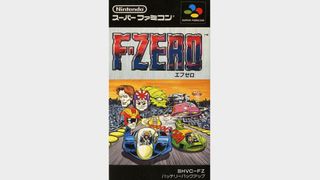
Nintendo's futuristic racer was specifically designed to impress, highlighting the console's Mode 7 background scaling and rotation capabilities from launch. The Japanese cover also made it look like the best comic you'd never read, with pilot heads superimposed over a dramatic scene in which Captain Falcon clashes with Pico. In fact, if you flip over to the back of the box you'll see a portion of that comic, which runs in full in the game manual. It instantly sells you on not only the high-speed racing action but the idea of the wider context in which F-Zero takes place.
Contra 3: The Alien Wars
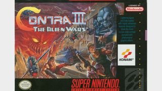
In a game as action-packed as Konami's classic run-and-gun, it can sometimes feel like the designers are throwing everything they have at you, all in one go. In this piece of cover art, Tom DuBois effectively conveys what that would actually feel like by including a wide variety of the game's most memorable moments in one piece of art. You can see the spinning rotors that you have to hang off of, the boss that tears open the walls, a tank, and all manner of regular enemies. It's totally over the top, in the way that all the best action movies of the era were.
Alien Breed

Team17's highly regarded top-down shooter Alien Breed was an action-packed affair, featuring plenty of opportunities to blast marauding extraterrestrials as you explored its maze-like stages. With that in mind, you'd expect a cover much like the Contra III one, but instead, we got an exercise in minimalism – apart from essential details like the format and memory requirements, it just features the title of the game and a menacing alien face on a black background. Where Contra III's cover creates a sense of overwhelming force to sell its challenge, Alien Breed puts all of its focus on a single terrifying threat.
Prince Of Persia
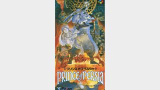
The SNES version of Prince Of Persia is a substantial update of the original game, so it was sad to see the American box art stick so closely to the original. By contrast, the box art for the Japanese Super Famicom release makes a major impression. The magnificently colorful piece puts the hero front and center but also incorporates the princess, Jaffar, and various enemies. Fans of videogame cover art will know just from a glance that this is the work of Katsuya Terada, whose distinctive style has also graced games including Virtua Fighter Remix and the Zelda series.
Ecco The Dolphin
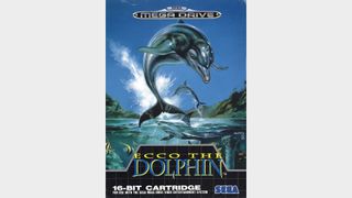
Renowned artist Boris Vallejo did plenty of videogame cover art in his time, often in the fantasy genre for which he is best known – you can see examples of this in Golden Axe II, Phantasy Star 4, and Might And Magic 7. However, one of his very greatest pieces was actually the painting used for Ecco The Dolphin's cover. The cloudless blue sky, clear water, and abundant fish give the impression of unspoiled nature, while the menacing shark and submerged pillar hint at the dangers and mysteries Ecco will face during the game. It certainly does plenty to entice potential players.
The Super Shinobi 2
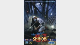
We typically don't associate stealth with immaculate white clothing, but perhaps that just goes to show just how good a ninja Joe Musashi is. That character design quibble aside, this is a great piece of art showing the heroic ninja creeping in the darkness against the backdrop of a moonlit sky, ready to strike at the first sign of danger. The art actually extends beyond the front of the box too, continuing on the back cover. This game is better known as Shinobi 3: Revenge Of The Ninja Master in North America and Europe, where it used a completely different piece of cover art.
Sonic & Knuckles
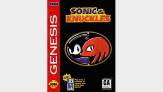
It's well known that Sonic 3 and Sonic & Knuckles were originally meant to be a single game, but the decision to split the game in two actually worked wonders. By introducing Knuckles as a rival to Sonic, Sega created the opportunity to promote the two characters teaming up as a big deal. The result was an absolutely iconic logo featuring the silhouettes of the two characters, and this was good enough alone to be the cover art for the game in all regions of the world. It's proof that a videogame cover doesn't have to be tremendously elaborate to be memorable.
Panzer Dragoon
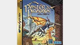
The works of the French artist Jean Giraud, known as Moebius, were a major influence on the visual design of Panzer Dragoon, from the creatures and machines to the very world they inhabit. With that inspiration in mind, it only made sense for Sega to commission the man himself to create illustrations for the game, and his distinctive interpretation of the game's iconic blue dragon ultimately became used as the cover art. Or at least, it did in Japan – for some reason, Sega of America and Sega Europe both used different 3D renders for their releases, which aren't nearly as nice.
Wipeout
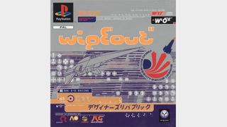
When the PlayStation arrived in the mid-Nineties, nothing seemed more cutting edge than Wipeout. The futuristic racer had fast and detailed 3D graphics, music from The Chemical Brothers and Orbital, and a look crafted by The Designers Republic. That was most evident from the amazing cover art, which bombards you with icons, logos, stylized text, and a wireframe image of one of the game's anti-gravity racing vehicles. The metallic silver ink set everything off nicely, too. A quick glance at this cover doesn't tell you a whole lot about what Wipeout is – you need to read the text to clock that it's a racing game – but it definitely makes you want to find out.
Final Fantasy 7
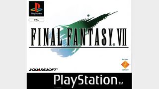
The minimalist approach of Sonic & Knuckles was one thing, utilizing the recognizable silhouettes of famous characters to provide a recognisability factor. Final Fantasy 7 had nothing like that at all – just a plain white background, black text, and an image of a meteor that players couldn't yet know the significance of. The cover stands out for how stark it is, and it's a clear sign of just how much confidence was behind this game. After all, this was the cover art for Europe, which had never even received a main line Final Fantasy game before, so it's not as if Square was coasting on name value.
The King Of Fighters 98: Dream Match Never Ends
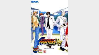
During the Nineties, SNK was famous for its ability to produce a variety of high-quality 2D fighting games, from Fatal Fury and Samurai Shodown to Art Of Fighting and The Last Blade. This could potentially lead to bored art staff – after all, there are only so many ways to draw an aggressive confrontation. Thankfully, SNK's artist Shinkiro had the kind of creativity that could through those kinds of concerns. Rather than opting for a conventional combat scene or fighting pose, he instead showed us the King Of Fighters crew looking sharp and enjoying the more relaxed environment of a poolside party.
Virtual On: Oratorio Tangram
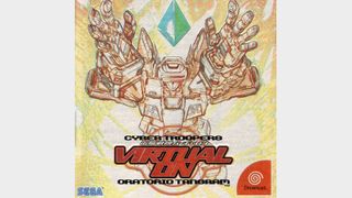
Unfortunately, we can't really do this one justice by showing it to you on a screen. The sketch-style image of Temjin is certainly striking, and Sega even moved the Dreamcast logo to ensure that it wouldn't be obstructed. It's the tangible qualities of the cover that elevate it, though – not only does it use metallic ink, but Temjin and the game's logo are also embossed to really make them pop. While digital game purchases certainly can be convenient, we can't help but feel that we'd be losing something without this kind of artistic approach to the physical packaging of games.
Ico
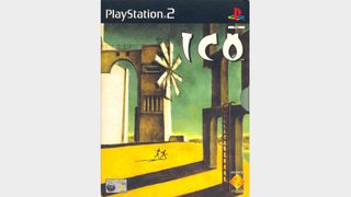
Ico's cover art was directly inspired by The Nostalgia of the Infinite, a painting by the Italian artist Giorgio de Chirico, whose work was a major influence on the Surrealist movement. It was actually created by the game director Fumito Ueda himself and depicts Ico leading Yorda across a seemingly deserted area, with a strong contrast between light and shadow. This art was only used in Japan and Europe, as the North American release got a generic character render – a considerably more conventional approach. The game originally failed to generate much consumer interest in any region but is thankfully now recognized as a classic.
Katamari Damacy

Namco's roll-'em-up (hush you, it's a real genre) is unashamedly weird, silly, colorful, and just plain fun. During the PS2 era, that sort of game tended to make publishers come over all funny. They were often tempted to be either too abstract or weird – see Super Bust-A-Move for an unfortunate example of that – or they'd be very direct and end up with a dull cover. Katamari Damacy avoids this trap, with a very clean look, simple colors, and an amusing juxtaposition of the gigantic ball against a serene foreground. It perfectly captures the odd, friendly nature of the game itself.
Resident Evil 4
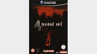
Prior to the series' incredible GameCube reinvention, most Resident Evil games had featured rather unsubtle cover art – and indeed, in Japan and North America, Resident Evil 4 did just the same. This European cover is far more effective in creating a sense of foreboding, with a dense forest silhouetted against a red sky, and birds flying away. Why? Because of that distant human figure, with what looks like a bag on its head and a chainsaw in its hand. You don't know what it is yet, but you're pretty sure it's out to get you, and it won't be long before it does
Every Extend Extra

If you've ever played this game, which was adapted from an indie PC game called Every Extend, you'll know that this game is about causing chain reactions of explosions. You'll also know that an accurate representation of a game screen won't do much to clue players in as to what the game's about. Seemingly aware of this, the cover artist decided to just create something as eye-catching as possible in the hope of making potential buyers curious. If absolutely nothing else, it's a lovely-looking piece of art and represents the colorful nature of the game well.
Catherine
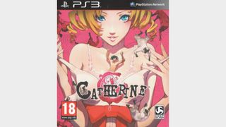
Plenty of games have used cheap sex appeal to sell, but Catherine isn't playing up a secondary theme here – the art relates to the core plot of the game. Your protagonist Vincent Brooks is caught in a dilemma after cheating on his long-term girlfriend Katherine with the Catherine you see on the cover here. There are differing opinions on how well that plot plays out, but Shigenori Soejima's art at least manages to tread a fine line, being provocative enough to capture the game's theme without becoming inappropriate for store displays. Vincent's vulnerability is well represented in his tiny size, and the tumbling sheep add some mystery.
Until Dawn

In this modern era of humdrum character renders, interesting concepts are few and far between, but Until Dawn is one of the more creative covers of recent times. The main image that catches your attention is that of the skull-topped hourglass, which provides a clear signal that this is going to be a horror game. What's nice to see is that the bottom of the glass is more of a snowglobe, as flakes fall from the top onto the cabin in which the game's events take place. The choice to highlight the setting and the stakes over the characters isn't common these days.
Nick picked up gaming after being introduced to Donkey Kong and Centipede on his dad's Atari 2600, and never looked back. He joined the Retro Gamer team in 2013 and is currently the magazine's Features Editor, writing long reads about the creation of classic games and the technology that powered them. He's a tinkerer who enjoys repairing and upgrading old hardware, including his prized Neo Geo MVS, and has a taste for oddities including FMV games and bizarre PS2 budget games. A walking database of Sonic the Hedgehog trivia. He has also written for Edge, games™, Linux User & Developer, Metal Hammer and a variety of other publications.
Most Popular


