The best box art of 2015
6. The Legend of Zelda: Tri Force Heroes
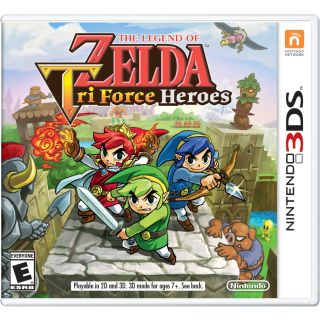
The Legend of Zelda: Tri Force Heroes cover could survive on the strength of its artwork alone, but there are few subtle additions that really set it over the top. First, notice how the colors in the background and logo are kept ever-so-slightly muted so as to make our heroes really pop. Second, the red Link's attire and use of magic sets him apart from the other two Links, setting up that this is going to cooperative adventure with different, distinct play styles.
5. Devil May Cry 4 Special Edition (JP)
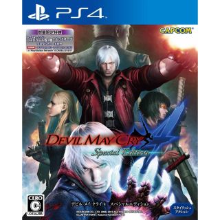
Japan has outdone itself again with this stellar piece of Devil May Cry box art, itself a parade of DMC mainstays past and present. The power of symmetry on display here is unmatched, right down to the mirror image of Vergil's sword and the smoke from Trish's gun. An overabundance of logos is the only thing holding this box back from perfection.
4. Batman: Arkham Knight
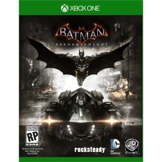
It's telling that Batman: Arkham Knight lends equal real estate to the Dark Knight and his iron steed. Both are centered up harmoniously with the logo, giving the entire box an aesthetically pleasing sense of verticality. The white light in the center serves a dual purpose by placing emphasis on Batman and symbolizing him as the last ray of hope in this dark night.
3. Until Dawn
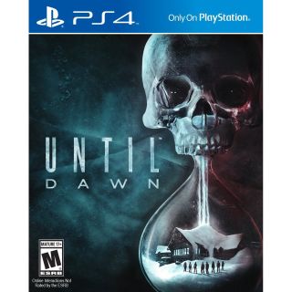
What an ingenious way to present a teen slasher. Typically, horror movies - which Until Dawn both mimics and subverts - have posters focusing on a single freaky face or creepy image, leaving little to absorb beyond the initial shock. But Until Dawn's box art draws you in with its skull-emblazoned hourglass, which seems to be made from a mixture of glass and ice. Its dwindling sands evoking the downpour of snow on your remote cabin, the time-rippling consequences of your choices within the game, and the ever-shortening life expectancy of its hapless visitors. And what's that glinting in the skull's eyes? Do you dare look any closer?
2. The Legend of Zelda: Majora's Mask 3D
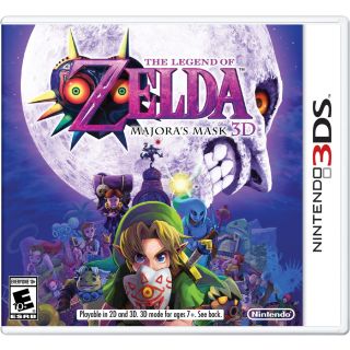
The blinding, pale white of the moon, coupled with its half grimace, makes this one of the most instantly arresting images on the lineup. Its presence looms as large here as it does in the game. In the foreground we see Link, gripping a mask that'll be key to this adventure, and behind him is the Skull Kid, twisting in the moonlight. Between them we catch a glimpse of the incredible journey that's about the unfold, with a special spot reserved for the oh-so-creepy Happy Mask Salesman. Together, they make a beautiful summation of the series' most melancholy stories.
1. Nobunaga's Ambition: Sphere of Influence
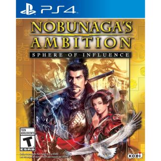
The purpose of box art is to sell the viewer on the game and the prospect of buying it. And even though I know, beyond a reasonable doubt, that I will never, ever take interest in a methodically paced large-scale tactics game set in feudal Japan, the Nobunaga's Ambition cover has my rapt attention whenever I spy it. The lavish gold bordering magnetizes the eyes, pulling you towards the overwhelming imagery at its center.
Everything you could ever want is here: a dashing, determined warlord with immaculate facial hair and a rifle hitched over his ornately armored shoulder. A beautiful woman in eloquent garb with an expression that could convey grace or guile. A hawk flying into a lightning bolt, which in turn is crashing between two battlefields on land and sea. After such a bounty, you can give your eyes a rest with the calm religious figures in the upper right, one of whom looks like a short-haired Jesus. True story: there were multiple occasions in 2015 when I saw this box, excitedly picked it up to look at the back, and came crashing back down to earth when I realized that it plays nothing like this art looks. But with a game, franchise, and genre this niche, the captivating allure of its box's visual splendor is its most powerful asset.
Sign up to the 12DOVE Newsletter
Weekly digests, tales from the communities you love, and more

