The best box art of 2015
Best of the best

We threw a lot of shade around with our Worst Box Art of 2015 lineup, so it's only fair that we give credit where credit's due to the best boxes of last year. Thankfully, narrowing this list down was much easier than the mind-rending onslaught of horrors that is worst box art. It's interesting to compare these two groups and see how many of the worst boxes fail because they overburned their coves with nonsensical imagery, while many of the best boxes smartly place one striking design against a stark backdrop - which is the case with our first entry...
25. Uncharted: The Nathan Drake Collection
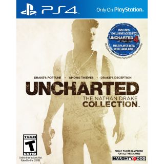
This cover for Uncharted: The Nathan Drake Collection elegantly captures the essence of Uncharted. The distressed look of the text, coupled with the map superimposed on Drake's silhouette, invokes the globetrotting spirit that's at the heart of this series. On his person we see Drake's ring, backpack, and gun - which pretty much sums up everything you need to know about gaming's Indiana Jones.
24. Splatoon
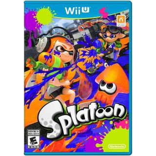
While most boxes in this year's lineup trade in muted elegance, Splatoon isn't afraid to be bright and fun. Neon colors explode across this cover, but there's a method to the madness. Along the ground we see a clear line separating orange and blue, as well as two orange- and blue-haired kids duking it out with squirt guns, which tells you exactly how Splatoon is going to play.
23. Dark Souls 2: Scholar of the First Sin
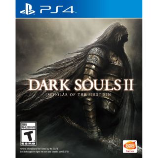
Speaking of "muted elegance," enter Dark Souls 2: Scholar of the First Sin, a game whose entire aesthetic can be defined by those two words. It may not by the most eye-catching cover, but the stoic, armored warrior - alone against a foggy backdrop - is the perfect primer for this game's style and tone. The intricate designs set against a decaying suit of armor establish the faded glory that permeates this series.
22. Wolfenstein: The Old Blood
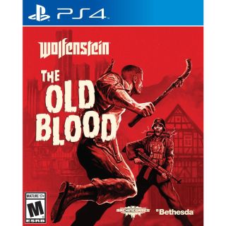
Wolfenstein: The Old Blood is a mean game, so it's only fitting the cover to this standalone expansion is evocative of a grindhouse movie poster. The monochromatic color scheme sets it apart from other games on the shelf, apropos of Blazkowicz's world being all blood and rage. Unfortunately, its best element - that screaming Nazi - is so far back you can barely discern his terror-stricken expression.
21. Yoshi's Wooly World

Seeing little yarn Yoshi riding little yarn Poochy in Yoshi's Wooly World taps into some deeply rooted cuteness instincts science has yet to fully explain. The feeling is almost primal, like when you see an adorable little kitten and you just want to hold it and squeeze it and gobble you up, yes I will, oh yes I will. Ahem, well, sometimes such ancient impulses are difficult to control.
20. Xenoblade Chronicles X

Xenoblade Chronicles X makes a lot of promises here. An overcast sky fills the frame while naturally drawing the eye towards the intricately designed robot in the center - star of both this box art and (let's be honest) the game itself. The alien landscape suggests an open world adventure with giant robots, while saying nothing of the 30 hours you'll need to spend before suiting up in your first mech.
Sign up to the 12DOVE Newsletter
Weekly digests, tales from the communities you love, and more
19. Minecraft Story Mode

Even if you don't give a rat's behind about Minecraft, you can't deny the captivating sense of adventure conveyed in this art. The blend of golds and purples pulls you in, first to the otherworldly creature screeching in the background, then to the motley crew of heroes arrayed along the bottom. Their expressions give you an intuitive impression of what their personalities, save for the pig. Who knows what it's thinking.
18. Code Name: S.T.E.A.M.

I'd like to take a moment and applaud the creators of this box art for the copious amounts of steam they were able to work into the Code Name: S.T.E.A.M. cover. It's piping out of the guns, the title - it's everywhere. This entire thing just screams steampunk, right down to the tiny little gears denoting the S.T.E.A.M. acronym.
17. Dying Light
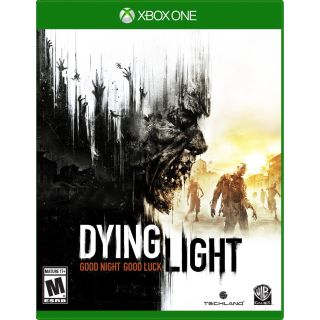
These days, zombies convey all the excitement and freshness of wet cardboard. But Dying Light stands apart with the unique artistry of this particular brain-eater, with the way he bleeds into the frame like a downpour of darkness on a sunny day. The hands reaching up from the depths of the darkened city could be those of hungry undead or desperate survivors reaching out for a savior.
