Before and after: the games that changed during development
From the first glimpse to the final game, see how these titles were nipped and tucked
Sam Fisher’s gone through some midlife crisis-sized changes over the past couple of years. One minute he’s a tortured emo agent on the run, with as little respect for the law as for kempt facial hair. The next he’s a malicious murderer, who makes Jack Bauer look like Jack Osborne.
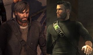
Above: From badly groomed to just plain bad
When we first saw Conviction in 2007 it had heavy influences from both the Bourne films and Assassin’s Creed. Two years on, though, the game looks more like traditional Cell fare… well, after ten cups of coffee and a couple shots of adrenaline. We'll see if ditching the shaggy-haired, radical design changes was the right decision when the game is released later this year.
Originally announced in 1995, the game went through several design teams over a ten year development period. It was continually crippled by technical problems, namely getting the game's ambitious portal system working. Technology finally caught up with the project’s lofty ambitions in 2005, when 3D realms borrowed id Software’s latest engine. The final direction the game adopted stayed true to the title’s original vision… more or less. The less being the part where Tommy was originally named Talon Brave and looked like a poor man’s Turok.
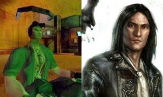
Above: Talon Brave - representing on behalf of First Nation since 1997 and Tommy – rocking leather since 2005
Thank the digital deities that the PS2 was an underpowered, horribly convoluted machine to develop for. Otherwise, one of our favourite games of all time, and definitely our most lovable lupus ever, would have looked something like this…

Instead of this…
Sign up to the 12DOVE Newsletter
Weekly digests, tales from the communities you love, and more
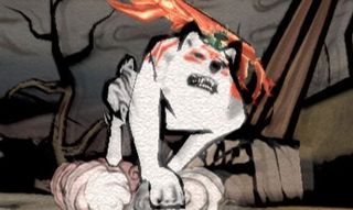
Early video footage shows Okami as a much more realistic adventure, with a lifelike, depressingly plain Amaterasu in the main role. Developers Clover finally ditched this design in favour of the title’s final sumi-e art style. In part, believing the painted look could better convey the game’s theme of harmony with nature. The far drearier original look was mainly dropped, though, as the PS2 (mercifully) couldn’t handle the more technically demanding style. Three cheers for the weedy 128bit generation.
Imagine you’re in charge of Rare during the N64 era. The Japanese giant has just realised Mario 64, and you’ve got to try and produce a platformer to match one of the greatest games of all time. What do you do?
Simple, you give the starring role to a saccharine sweet, nut-throwing squirrel, in a world so sickly sweet it makes the average Disney magical kingdom look grim like a diarrhea-smeared public toilet. Then you chuck all of that and make said squirrel a raging alcoholic/borderline sex pest/recreational drug user in a darkly comic South Park-style world.

David has worked for Future under many guises, including for 12DOVE and the Official Xbox Magazine. He is currently the Google Stories Editor for GamesRadar and PC Gamer, which sees him making daily video Stories content for both websites. David also regularly writes features, guides, and reviews for both brands too.
