As Spyro the Dragon turns 25, we remember what made the purple platformer such a fierce fire starter
Join us as we celebrate a quarter-century of one of video games' most iconic mascots
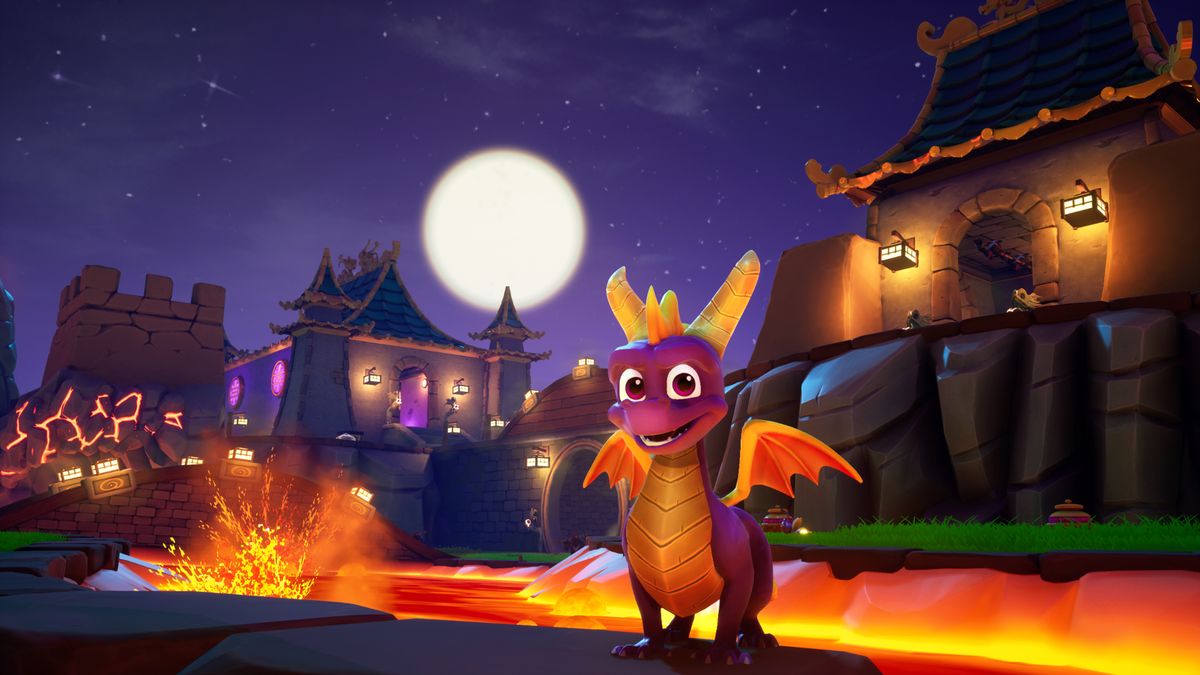
The concept of the third dimension understandably doesn’t seem so alien to us nowadays. While it’s come full circle and now pixel art is seeing a resurgence in seemingly every other new indie game released on Steam, back when the PlayStation was causing a ruckus it was 3D graphics that was all anyone could talk about. Genres were being torn from their traditional, two-dimensional perspectives and thrust into the black fog of early 3D. Almost overnight, gaming had once again become a frontier, and inventive ways of gaming were being adopted and adapted with practically every new release. While Spyro wasn’t the spark that caused the explosion, the fiery character certainly helped keep it ablaze after the likes of Super Mario 64 and Crash Bandicoot had already begun to popularise the concept of the 3D platformer.
In fact, there are close ties between Naughty Dog’s destructive orange mascot and that of Insomniac Games’ purple equivalent. It began with Disruptor, an impressive, if overlooked, cinematic shooter developed by Insomniac. Though it hadn’t sold well, publisher Universal – which had also worked with Naughty Dog on Crash Bandicoot – was impressed enough to go ahead and commission a second game from the young studio.
The focus on dragons for the next game was there from the very start thanks to studio artist Craig Stitt and his fondness for the mythical winged lizards. The ability to fly was a big boon for the game, since it added a whole extra layer to the 3D platformer genre that didn’t really exist previously. Just think of Mario’s winged cap in Super Mario 64 and how that brief burst of three-dimensional freedom just felt so thrilling. Spyro would have that freedom permanently and would be designed with flight in mind.
Heating up

For more in-depth features on classic games and consoles delivered directly to your door or device, subscribe to Retro Gamer in print or digital.
But in fact the initial style of the game was completely different. Despite the desire to create something more lighthearted than Disruptor – hence the push for a dragon – the look of this platformer still leaned closer towards dark and gritty. The inspiration, in fact, was 1996 flash-in-the-pan movie DragonHeart, with Insomniac wanting to capture a similarly sombre approach to fantasy. Spyro was initially to be named Pete – as hard as that might be to imagine – a comically pedestrian name, and one associated with a 1977 movie, that may well have been intended to be taken seriously but was supposed to be a mythical dragon and all that entails. The change came about fairly early on in development, with guidance from Mark Cerny – who was then working at Universal Interactive – to change direction to something more family friendly. The reasons were many, but primarily it was to target a younger demographic in a bid to take a slice out of Nintendo’s domination.
Mark never quite forced the change, but was eager to see Insomniac switch tact after noticing that the PlayStation was targeting an older audience than the N64, and that the space for a high-quality family friendly game was waiting to be filled. Pete became Spyro and a more colourful, Disneylike tone was adopted. Mark’s input didn’t stop there, though. The executive producer had the idea for a panoramic 3D engine, essentially meaning large open environments that didn’t suffer from the same dark fog that so many PlayStation games did. It was up to Insomniac’s Alex Hastings to make this dream happen, however, who resorted to assembly language – which was rarely used, even at the time – for the majority of the coding. And in fact Spyro’s engine would become quite inventive, essentially using two separate engines: one to render the distance in lower polygonal quality and one to render the closer spaces in much better detail, transitioning between the two seamlessly as and when they were needed.
Nowadays this is a common technique to maximise visual fidelity, and back then Insomniac was something of a pioneer with this tech. This engine would become an integral part of the game’s design and would allow players to see far into the distance and help to ascertain the gaps that they were looking to glide across. Without this engine powering the game, Spyro The Dragon would have had to be a different experience entirely; there would have been no option for floating islands with secret treasure or long distances to traverse as part of platforming. Even the bright, cheery tone would’ve felt more oppressive and grim if it had suffered the same dark fog of early 3D and likely not have become the popular PlayStation mascot it ultimately ended up being.
"Spyro, conversely, was met with immediate positivity, releasing in 1998 to praise from most publications, a top-tier position in the sales chart (just below Tomb Raider, as it happens) and a space in the gaming mascots hall of fame."
Of course this would have all been for nothing if the character of Spyro couldn’t match the qualities of the environments. For that, Charles Zembillas took control of the initial design, brought on because of his work creating the look of Crash Bandicoot – Naughty Dog and Insomniac were both close developers, physically and socially. This was how the Disney-esque look was formed, with Charles’ concepts used to define both the appearance of Spyro and his various cohorts, but also the animations the characters used to express that cartoony vibe.
Sign up to the 12DOVE Newsletter
Weekly digests, tales from the communities you love, and more
It was Kirsten Van Schreven that would take control of the design of the different worlds, however, and she saw fit to shake up the tried-and-true formats that platformers usually came with at the time. Gone were the concepts of the snow stage, the desert stage, or the jungle stage, and instead a much more original style that was all the more mystical and in keeping with the fantasy theme was implemented. The starting world of Artisans, for example, was a fairytale landscape, while the second zone, PeaceKeepers, provided a more battle-worn environment. It was unique, and only helped Spyro stand out all the more.
But more than that, Spyro The Dragon shunned traditional stage-by-stage platforming gameplay in favour of something more akin to Super Mario 64’s level of choice. Rather than leaping into pictures, however, Spyro would travel through a warp-gate – with a neat effect of seeing a 2D plane projecting the skyline of the destination – to travel without noticeable loading screens to individual stages. The openness of its gameplay was unlike anything seen on the PlayStation before and considering the technical stresses that ensued from this, Insomniac certainly didn’t take the easy way out with Spyro The Dragon. But then this was a developer looking to prove itself. Disruptor had been a ‘successful’ failure, proving the technical skills of the studio but struggling to garner any commercial acknowledgement for it.
Spyro, conversely, was met with immediate positivity, releasing in 1998 to praise from most publications, a top-tier position in the sales chart (just below Tomb Raider, as it happens) and a space in the gaming mascots hall of fame. Ultimately going on to sell almost 5 million copies across the lifetime of the PlayStation, the character might have looked like just any another platforming mascot, but few games have had the lasting appeal of the purple dragon. And while Insomniac Games has since outgrown the series, the demand to see them back in the driving seat of the franchise never really went away. Perhaps if Spyro’s revitalised new look turns out to be a winner, that’s something that fans might just get to see.
This feature first appeared in Retro Gamer magazine. For more like it, you can pick up a single issue or subscribe over at Magazines Direct.
