8 hated box art cliches
Designers should take a break from these overused visuals
7. I have one eye and I cannot blink
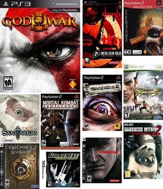
Above: There’s an eye-related pun here we should be taking advantage of but we won’t
Placing a giant head on your cover is attention-grabbing. Placing half of a giant head on your cover is attention-grabbing and mysterious. With that kind of thinking, focusing your entire cover on a single eyeball whose unwavering stare burns itself into every single neuron in your brain is seriously just some creepy shit. Unless you’re allowed the ability to shoot lasers from your eyeballs or your mortal enemy is a gelatinous orb whose only weaknesses are anything citrus or an early case of cataracts, stop freaking us out like this.
8. Say aaaaaaaahhhhh
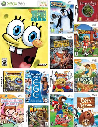
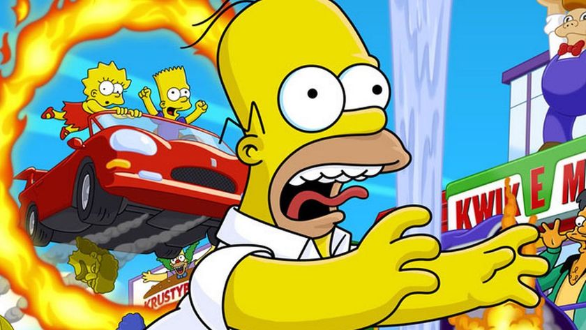
Above: Careful, your face my freeze that way
There’s a direct correlation between the amount of excitement you can expect from a game with how big a character’s mouth is on the cover. For instance, the rarely discussed Seventh Commandment of kid-friendly box art design states, “Thou shalt have all characters screaming obscenities.” Thankfully, modern technology has yet to catch up to sound-based box art, but when it does the ESRB is going to have a field day.
Bonus: The JRPG character collage
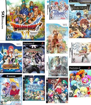
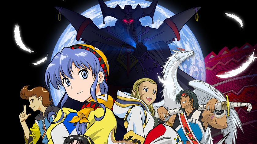
The JRPG genre is rife with visual clichés; big spikey hair, heroes who never look older than 16, impossibly sized weaponry, innocent looking women, cute animal-based sidekicks. Thankfully, if you weren’t familiar with those you can almost always count on all of them being represented in another clichéd fashion: the all hands on deck character collage. Setting? Environment? Enemies? What’s that?
Hey, you know if you move that purple-haired girl over to the left you could make the protagonist’s weapon even bigger, right?
Apr 27, 2011
Sign up to the 12DOVE Newsletter
Weekly digests, tales from the communities you love, and more


40 of the year's ugliest attempts at game packaging
Nine astounding differences between East and West
It's not just bad, it completely misses the point
Palworld dev says the studio went dark for months because "the team was getting burnt out from all the social media stuff, I was getting burnt out, our CEO was under attack in Japan"
Metaphor: ReFantazio had to dial back an early battle system inspired by a notoriously brutal 2003 JRPG, because 20 years later, players found it "irrational" and "just not fun"

