8-bit levels in LittleBigPlanet
Four classic stages painstakingly re-created in the PS3’s most creative game
When we finally got hold of a copy of LittleBigPlanet, we almost immediately went to work trying to make that idea a reality. The first, obvious step was to remake the universally recognized first level of Super Mario Bros., but someone had already beat us to the punch, and did so brilliantly:
With competition like that, it was clear we’d need to dig a little deeper when coming up with our own attempts. Before that happened, though, we needed to assess exactly how complicated it would be to really recreate the old levels, instead of just kludging together rough approximations. Turns out it’s a lot more complicated than you’d think; while old-school game designers got to make up new rules of physics for their games as they went along, LittleBigPlanet confines players to using what’s built into the game. And while that’s a lot to work with, there are certain things – like climbing ladders – that Sackboy just can’t do.
There was also the question of how exactly to get the old sprite textures into the game, as there’s no way to import images directly from, say, a PC. There is an interesting workaround, though; because LBP enables players to make “stickers” out of images captured with a PlayStation Eye, recapturing the 8-bit look of the original levels was as simple as pointing the camera at a blown-up image in Photoshop.
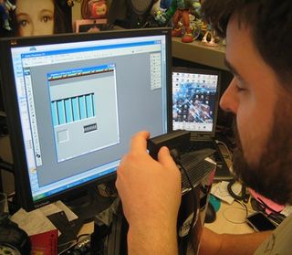
Above: I spent hours being paid to do this. Hours!
Once we’d figured that one out, the rest was a matter of (incorrectly) judging the scale that we should make each level to, finding clever workarounds for certain enemies and obstacles and trying to work within LBP’s memory limitations, which are surprisingly confining once you’ve wallpapered an entire sprawling level with tiny photo stickers and attempted to fill it with simple, AI-driven creatures. And after a couple of weeks of constant work, we came up with the following (which you’ll be able to play once the game ships – just search for levels created by GamesRadar3):

For this one, we opted for Donkey Kong’s iconic first stage. Seriously, does anyone but the game’s most dedicated fans even remember any of the levels that came after?
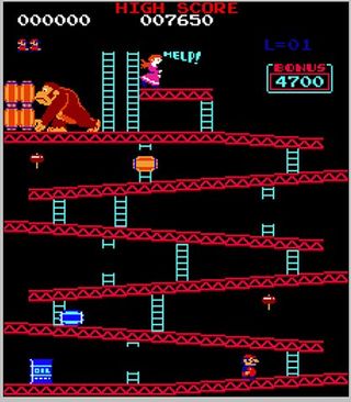
Above: Near-perfection on a single screen
Sign up to the 12DOVE Newsletter
Weekly digests, tales from the communities you love, and more
Of course, certain sacrifices had to be made. Because ladders don’t work in LBP, ours are purely decorative, and the elevation of the ramps had to be changed a little in order to enable players to jump their way up to the top.
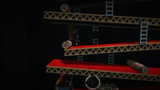
Because of that change, actually making the Donkey Kong’s barrels lethal to the touch made the stage way too difficult, so we had to make them mostly harmless. But for what it’s worth, they’re still a lot of fun to jump over.
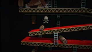
And hey, check out the real fire effects on top of that blazing giant oil drum!
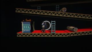
Getting high enough to rescue Mario’s long-forgotten ex-girlfriend Pauline might seem a little daunting at first – but since DK is huge, inanimate and harmless, we’re betting you can figure out a way up there.
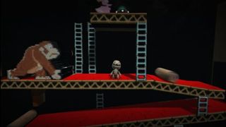
Success means hitting a switch that destroys the entire stage, but don’t worry - Pauline shows up at the end, safe, sound and shooting hearts out of her forehead:
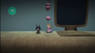
To see the level in its entirety, check out the video below:

Our next attempt at re-creation is Parapa Palace, Zelda II’s first dungeon, which is famous for not being named after a rapping puppy. This turned out to be a Herculean undertaking, filled with elaborate designs, idiot creatures who were more eager to fall over and die than to attack us and keys that disappeared before we could open the doors they were meant for. A few tweaks made it all work out in the end, but there’s a reason these stages originally took teams of professionals months to build.
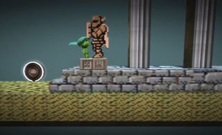
Above: Sackboy admires an eerily large Ironknuckle statue…
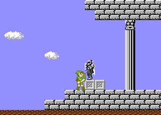
Above: …which was lifted directly from here
The elevators work great, although they're not freely controllable like their NES counterparts.
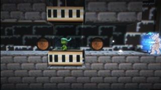

We were even able to recreate Zelda II’s awesome locked doors, which will instantly disappear if you drag the corresponding key over to them.
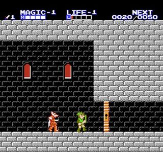
Interestingly, having the keys be draggable blocks neatly solved a problem with certain monsters that were too tall to hop on, thereby destroying their glowing “brains” and causing them to poof into nothingness.
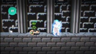
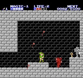
Hey, remember this guy?
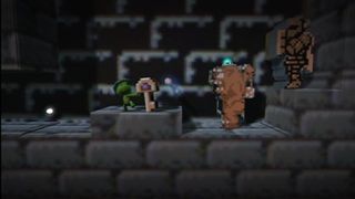
Our version is somehow nowhere near as awesome as his NES counterpart, we’re sad to admit.
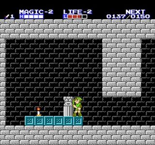
And hey, we even included the candle!
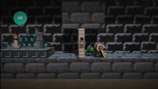
In the NES version, it was an invaluable tool for lighting your way through dark areas. Here, though, it’s really just a façade that sits in front of a huge morass of score bubbles to reward players who actually trekked this far out of their way.
Above: No score bubbles here, sorry.
And finally, there’s Horsehead, one of the game’s most memorable bosses. Here, he’s a lot easier to defeat, seeing as we just made his mace a retractable platform for jumping on top of his head.
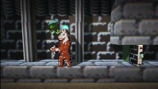
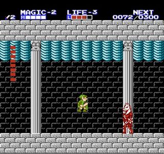
Above: Ours might have a slightly novel strategy, but the original is still cooler
Once again, you can see the whole thing for yourself in this video:
Super Mario Bros 2 player crashes the game, casually posts the clip online, and accidentally makes "the biggest 2D Mario speedrun discovery in years"
Hollow Knight: Silksong is so late that this stylish and extremely Hollow Knight-inspired Metroidvania, made by a studio called Whalesong, might launch first

