50 Worst Photoshop Movie Posters
Design disasters
Crazy On The Outside
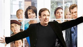
If we had that gaggle of zombie-ish cardboard cut-outs trying to get in, we'd be blocking the door too.
What To Expect When You're Expecting
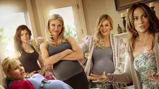
The attack of the disappearing neck strikes again (sorry Elizabeth Banks), while the other ladies stand around in a collective disassociative fugue.
My One & Only
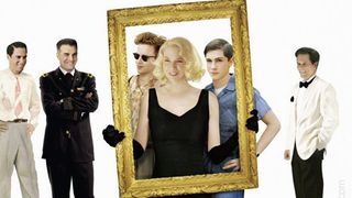
There's a reason you've never heard of this Renée Zellweger comedy drama.
The quality of the poster gives a good inclination towards the quality of the movie itself.
December Boys
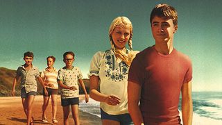
Appearing next to Daniel Radcliffe on a poster would always be intimidating. You have to find some way to stand out.
So why not throw in some perspective slanting that makes all the boys look like giants, and a girl with all the waxy photoshopping and jarring posture of a mannequin.
Nothing To Lose
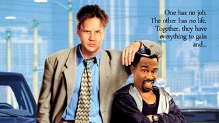
How to play up the odd-couple relationship between a pair on a poster?
Sign up for the Total Film Newsletter
Bringing all the latest movie news, features, and reviews to your inbox
Well, make them as different as possible of course! Including adding an extra foot's difference in height for no discernible reason whatsoever.
There is an approximate 20cm height different between Tim Robbins and Martin Lawrence in real life (we googled it and everything). This poster suggests it's more like 20ft.
Death At A Funeral
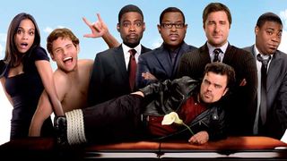
Most actors have a 'No Nudity' clause for good reason.
James Marsden seems to be part of that gang - because that is definitely not his body attached to his head. If it is, he's been hiding a pretty spectacular side-career as a contortionist.
And quite what Zoe Saldana is doing with her hand is best left unasked.
Life As We Know It

It wasn't the most exciting of romcoms, to be sure.
But Katherine Heigl can't even be bothered to look at Josh Duhamel. Or the child they're supposed to be caring for.
My Best Friend's Girl
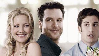
If you're trying to sell an engaging love triangle, it'd probably help if you actually had your leads engaging with each other.
Or, we don't know, even looking at each other.
Two Lovers
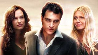
Weird light auras, over-exposure, photoshopped de-aging and a whole host of bland. Bah.
Venus
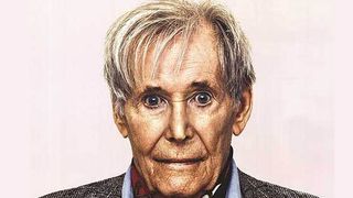
Usually we're all for natural age-relative depictions of people on movie posters.
But it feels like they're gone too far the other way with Peter O'Toole who looks bizarrely over-aged. Even if that's the case, at least pick a facial expression that isn't quite as poop-inducingly panicked.
Most Popular


