50 Worst Movie Posters Of 2011
Woeful one-sheets

Johnny English Reborn
The Poster: Not the most offensive on this list by a long chalk, but nevertheless, this is a monumentally bland offering. Then again, if you’re off to a film that was based on an advert, maybe bland is your bag.
Worst Detail: The random bits of flame that appear to be singeing Johnny’s tux.
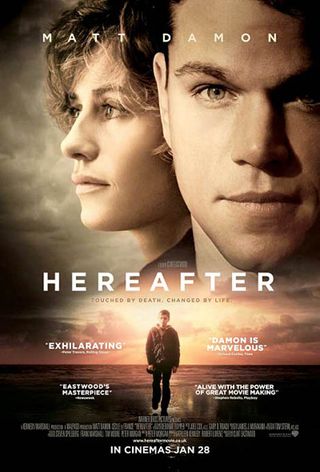
Hereafter
The Poster: We are thoroughly sick of seeing actors’ disembodied heads floating in the clouds. Enough of this, Hollywood!
Worst Detail: The whimsical, moist-eyed expressions. It may as well have “This will make you cry” scrawled on it in magic marker.
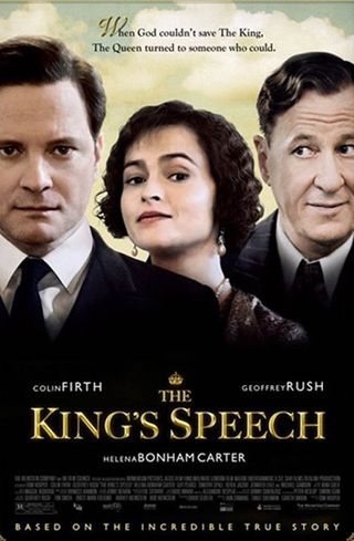
The King's Speech
The Poster: Colin Firth, Helena Bonham Carter and Geoffrey Rush, all of whom appear to be starring in different films. Photoshopping at its shoddiest!
Worst Detail: The cloud detailing behind the trio. They’re standing outside then are they? Okay…
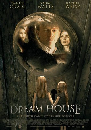
Dream House
The Poster: Far too much going on here, as three leads, creepy kids, ominous tagline and imposing wooden door all fight for space.
Worst Detail: Rachel Weisz appears to have been replaced by a none-too-convincing lookalike. Seriously, who is that?
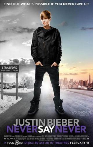
Justin Bieber: Never Say Never
The Poster: The teen icon stands slouched on a nondescript road, a slight smirk playing across his lips. This man is after your childrens’ money. Fear him.
Worst Detail: The eighteen-wheeler looming in the horizon. Only kidding! Sadly.

Breaking Dawn pt. 1
The Poster: Robert Pattinson and Kristen Stewart have a bit of a cuddle. Same as it ever was…
Worst Detail: The sheer complacency of it. It’s almost as if millions of people will flock to see this regardless of what the poster looks like. Oh.
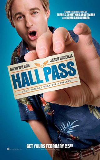
Hall Pass
The Poster: Owen Wilson does his best howler monkey impression in this gormless ad for the Farrelly brothers comedy. Seriously, what’s wrong with his face?
Worst Detail: Dopey expression aside, Owen’s hand looks way out of scale. How big must his arm be?
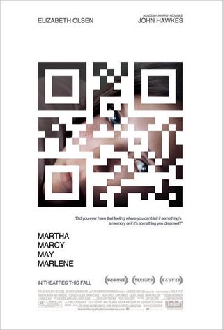
Martha Marcy May Marlene
The Poster: Yes, we’re sure the marketing men were thrilled by the idea of slapping a QR code over the main image, but it doesn’t do much for the general aesthetic does it?
Worst Detail: The code. We thought we said?

A Dangerous Method (International)
The Poster: Well we certainly know who’s starring in this one, don’t we? Because there are their faces, look. As for what the film is actually about? Work it out for yourselves.
Worst Detail: Why do they all look so shiny? It’s most disconcerting.
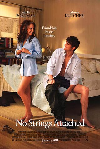
No Strings Attached
The Poster: These beautiful Hollywood people have just finished shagging each other’s brains out. What are you doing with your life?
Worst Detail: The appallingly smug expressions on both of their beautifully sculpted faces. Excuse us while we puke.
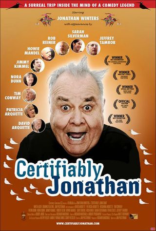
Certifiably Jonathan
The Poster: Jonathan Winters slaps his big, gurning face front and centre of this OTT one-sheet. Put it away mate.
Worst Detail: Winters’ mugging reeks of “Ooh-er, I’m mad me” twattishness. Stop trying so hard!
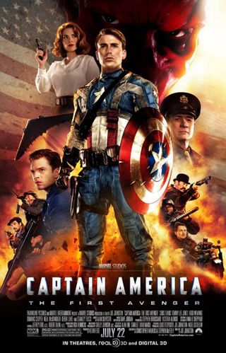
Captain America: The First Avenger
The Poster: Had Drew Struzan drawn this, it could have been brilliant. But he didn’t, and it isn’t. Shame.
Worst Detail: You can see nearly all the joins. Why? Because it wasn’t hand-drawn. Lovely idea, but only if you don’t cut corners.
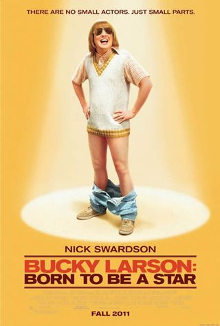
Bucky Larson: Born To Be A Star
The Poster: You probably haven’t heard of this half-baked porn spoof. And this poster will be unlikely to encourage you to seek it out.
Worst Detail: Bucky’s expression has us involuntarily balling up our fists…
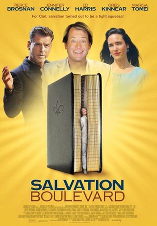
Salvation Boulevard
The Poster: Wha? Huh? Bah? This one defies all explanation. Why has this happened?
Worst Detail: A photo of Greg Kinnear that appears to have been lifted from Facebook and plonked slap bang in the middle of the poster.

W.E.
The Poster: Could they have found two less flattering images of Andrea Riseborough and James D’Arcy? Good Lord…
Worst Detail: The prevailing mauve haze that casts an air of “meh” over the whole shebang.

The Smurfs
The Poster: The Smurfs have tried to ride the subway see, but *ha ha* they’ve only gone and got themselves *hee hee* stuck in the ruddy doors! Baaaaaaa-ha-ha-ha! Aaaah…
Worst Detail: The ghostly occupants of the train. Is this supposed to be a haunted subway?
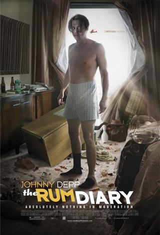
The Rum Diary
The Poster: Johnny Depp stumbles around a computer-generated hotel room looking rather the worse for wear. A good idea, poorly executed.
Worst Detail: We can understand making Depp look a bit haggard for this one, but why are his boxer shorts pulled up to his belly button? Odd.

Hugo
The Poster: Whilst the alternative poster showed Asa Butterfield dangling from the hands of a vast golden clock face, this is just a big old key. A nice key, sure, but a key nonetheless.
Worst Detail: The absence of any other detail, asides from the key. What in God’s name is this about, you may well ask…
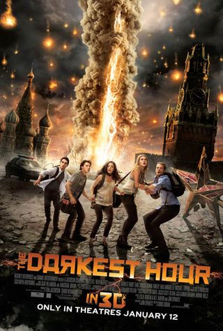
The Darkest Hour
The Poster: Moscow is under attack from the largest indoor firework known to man! At least that’s what it looks like from this poster…
Worst Detail: Those “woah, dude” facial expressions. Is that any way to greet an invisible horde of alien invaders?
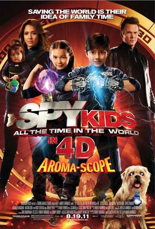
Spy Kids 4D
The Poster: It’s a poster bright, bold and busy enough to induce an unwanted seizure, and the actors all look as though they’ve been fashioned from cardboard. What’s not to love?
Worst Detail: The dog. From the look of its eyes, it’s just caught a glimpse of the poster.
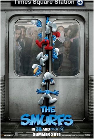
The Smurfs (Teaser)
The Poster: Everything about this is irritating. Absolutely everything.
Worst Detail: The use of a pop-culture reference from nearly 20 years ago.
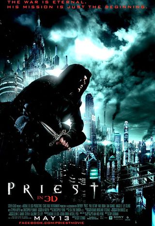
Priest
The Poster: You can see what they were going for here – futuristic cityscape, Gothic moodiness, the sense of imminent danger… sadly, it’s all a big mess, isn’t it?
Worst Detail: There’s just way too much going on here for any of it to have much of an effect. Sometimes, less is more.
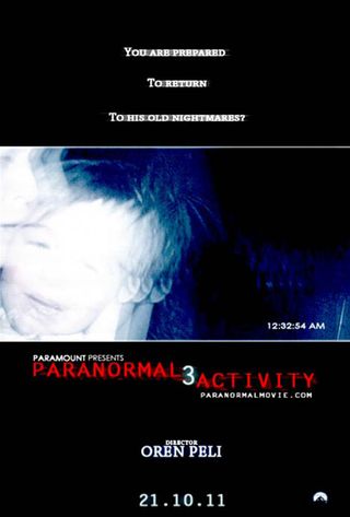
Paranormal Activity 3
The Poster: Hmm, this one looks familiar doesn’t it? Almost as if we’ve seen it before… on two separate occasions.
Worst Detail: The fact that it’s exactly the bloody same as the last two entries in the franchise. It might be too much fuss to come up with a new plot, but they could at least freshen the poster up a bit!
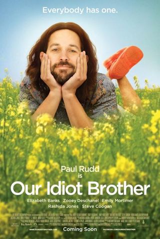
Our Idiot Brother
The Poster: Paul Rudd is crudely photoshopped into a colourful meadow. At least the beard looks real…
Worst Detail: The join between Rudd’s forearms and the yellow flowers is painfully obvious.
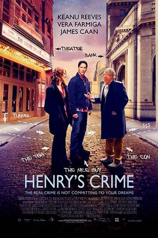
Henry's Crime
The Poster: Three cut-out characters, placed against a jarringly mismatched backdrop, with felt-tip annotations thrown in for good measure.
Worst Detail: Keanu looks like he’s wondering if this is another glitch in The Matrix…
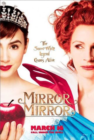
Mirror Mirror
The Poster: A transparent rip-off of The Princess Bride , with Lily Collins playing cutesy to Julia Roberts’ sour-faced (but flatteringly airbrushed) villain.
Worst Detail: Twin taglines? Come come, there really is no need.

Main Street
The Poster: An ensemble piece in which half the cast appear to be being devoured by a ravenous white mist.
Worst Detail: We’d like to say Orlando’s hideous ‘tache, but it’s the clumsily placed title sign that takes the prize. Honourable mention goes to the names of the cast colliding with Firth’s coif.
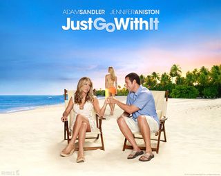
Just Go With It
The Poster: Adam Sandler attaches himself to another pair of improbably attractive women, this time in the form of Jennifer Aniston and Brooklyn Decker. Take one look at this poster. You’ve now seen the film.
Worst Detail: Sandler’s cheeky “I’m one of the lads, me” smirk. Somebody give that man a slap.
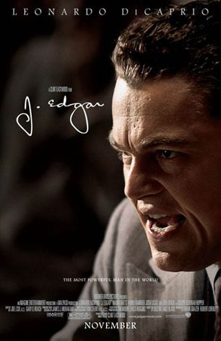
J. Edgar
The Poster: Leonardo Di Caprio is cross. Very, very cross. And that, ladies and gentlemen, is all you need to know.
Worst Detail: It’s the lack of detail that’s the real problem. We’re dead against spoon-feeding an audience, but we could do with a little more than Leo’s big, shouty face!
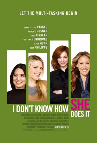
I Don't Know How She Does It
The Poster: This irritatingly-titled chick-flick opts for a sludge green colour scheme and bar-chart design aesthetic. Mmm, exciting!
Worst Detail: The tagline: “Let the multitasking begin.” Not before the lazy gender stereotypes get started, mind.
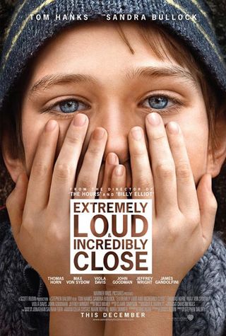
Extremely Loud And Incredibly Close
The Poster: Extremely unsettling and worryingly crap, more like. What is wrong with that little boy’s hands?
Worst Detail: Those eyes. They’re looking into our very souls!

Cowboys And Aliens
The Poster: Having already released an enigmatic and moody poster in which Daniel Craig stood facing away from the camera, Universal undid all their good work with this dull production still!
Worst Detail: The ultra-bland font for the title. It’s difficult to make the words “Cowboys And Aliens” look boring, and yet…
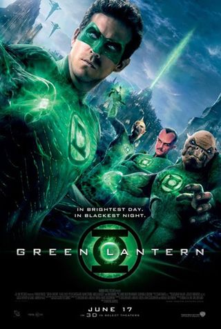
Green Lantern
The Poster: An unwelcome preview of the shonky CGI that blighted Ryan Reynolds’ spandex-clad debut. Truly ugly.
Worst Detail: Kilowog looks as though he’s been drawn in with crayon!
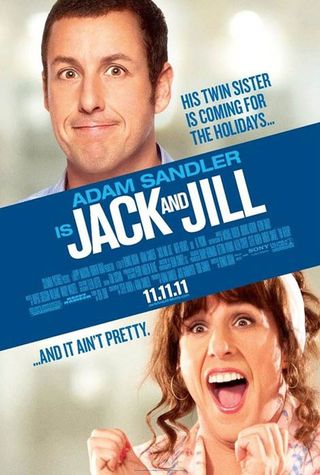
Jack And Jill
The Poster: What’s more irritating than Adam Sandler? Adam Sandler in drag playing Adam Sandler’s twin sister, that’s what.
Worst Detail: The description of said sister as “it”. Nice and PC there…
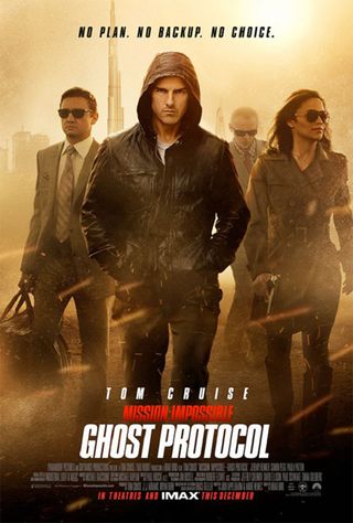
Mission: Impossible - Ghost Protocol
The Poster: Of all the possible ways to promote one of the most action-packed event movies of the year, surely Paramount could have come up with something better than Tom Cruise scowling out of a hoody?
Worst Detail: The sandstorm that appears to be obscuring his co-stars. No mistaking who’s the star of this film, eh Tom?

New Year's Eve
The Poster: A yearbook-style rogues gallery of shameless Hollywood A-listers, each of whom appears to be asking their neighbour, “and what will you be spending the money on?”
Worst Detail: Ludacris and Bon Jovi we can forgive, but De Niro? Have some pride, man!
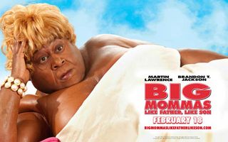
Big Mommas: Like Father Like Son
The Poster: Also a contender for worst title of the year, the sequel nobody wanted gets an equally unloveable poster. Urgh.
Worst Detail: The despairing look in Lawrence’s eyes as he ponders whether or not the fat-suit is still funny. Not to worry Martin, it’s as amusing now as it ever was…
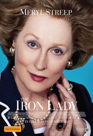
The Iron Lady
The Poster: How best to promote a movie about Margaret Thatcher? Go for the extreme close-up, that should do it. It might work as a quad, but as a one-sheet? Too much.
Worst Detail: At this distance, that hair makes her look like an extra from Mars Attacks!
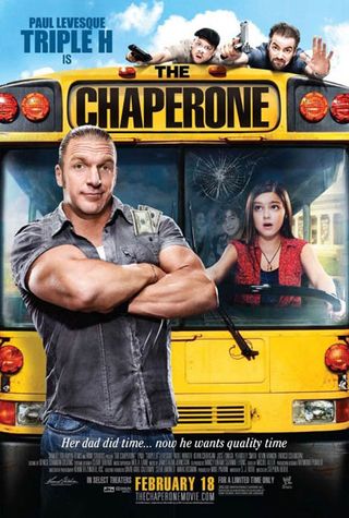
The Chaperone
The Poster: WWE’s Paul “Triple H” Levesque branches out into kids movies with this lurid offering. At least that bus is about to put him out of his misery.
Worst Detail: The tagline: “Her dad did time… now he wants quality time.” Should that really sound quite so threatening?
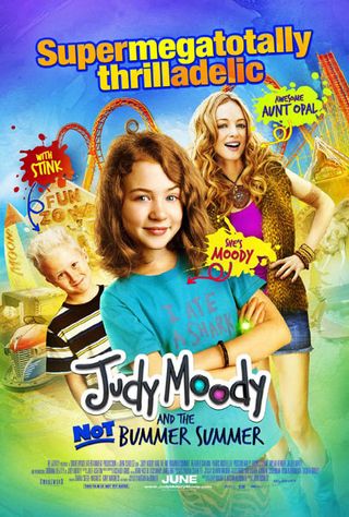
Judy Moody And The Not Bummer Summer
The Poster: We know this one is supposed to be appealing to kids, but surely there aren’t enough E-numbers in the world to make that colour-scheme seem palatable. Our poor eyes…
Worst Detail: Why is “Awesome Aunt Opal” dressed like a prostitute?
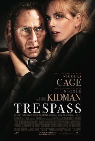
Trespass
The Poster: Nic Cage looks mad here, but not as the studio probably intended. This is more, “I’m off my meds, why is that wall shouting at me?” No wonder Nicole Kidman looks scared.
Worst Detail: His eyes. They look as if they’re about to roll back into their sockets!
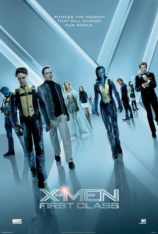
X-Men: First Class
The Poster: Aargh, their badly photoshopped heads are coming to get me! Look away children, LOOK AWAY!
Worst Detail: The opaque nether-world through which our heroes appear to be striding. Oh well, at least Fox couldn’t do any worse than this, right?
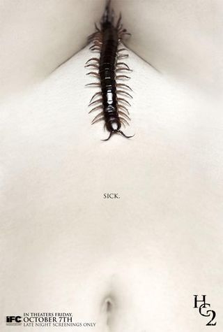
The Human Centipede 2
The Poster: Yes, it’s inventive. Yes, it grabs the attention. Yes, it’s utterly repulsive. Next!
Worst Detail: The, uh, centipede. Obviously.
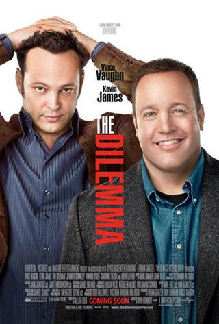
The Dilemma
The Poster: Kevin James is smiling, Vince Vaughn is not. From that information, Universal expects you to surmise that James’ wife is cheating on him and Vaughn is wrestling with whether or not to tell him. Clear as day, isn’t it?
Worst Detail: Vaughn’s heavily re-touched face looks even more reptilian than usual.
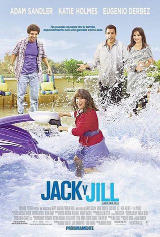
Jack And Jill (Mexican)
The Poster: As if the American one wasn’t bad enough, Mexican audiences were treated to this monstrosity. Who likes zany jet-skiing twins then? Good, well come and watch this…
Worst Detail: We’d point out the terrible perspective issues, but it’s the cloying wackiness of this one that really gets us. Katie Holmes’ “lobotomise me now” expression says it all.
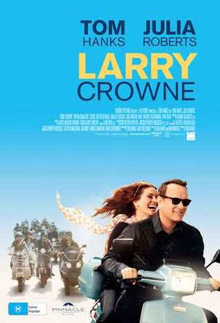
Larry Crowne
The Poster: Middle age doesn’t have to be boring! Look at these two twinkly-eyed souls, falling in love and riding a scooter like it’s the most natural thing in the world. Oh no wait, it looks effing tragic.
Worst Detail: The accentuated “Tom” and “Julia” of the two stars’ names. Oh hey it’s Tom and Julia! We know them from all those movies. We’ll probably like this one! Unbearably pleased with itself.
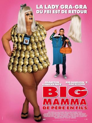
Big Mommas: Like Father Like Son (French)
The Poster: Lord almighty, this is one of those images you’d pay good money to have scrubbed from your memory. Martin Lawrence dressed as a fat woman won’t cut it any more, apparently. Now he has to look like Lady Gaga as well. Hell in a handcart…
Worst Detail: We’re not sure what expression Lawrence is going for here, but we don’t like it.
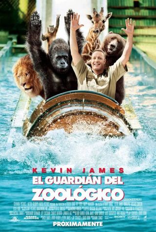
The Zookeeper (Spanish)
The Poster: This is so deliriously awful it’s almost brilliant. In fact it is brilliant. Where can we order one?
Worst Detail: Kevin James’ shit-eating grin aside, it has to be the gorilla’s poorly photoshopped arms. Dear oh dear.
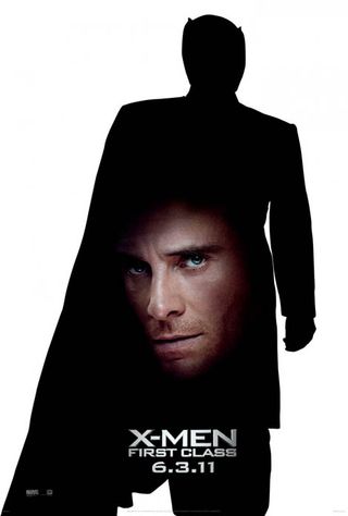
X-Men: First Class (Magneto Teaser)
The Poster: It genuinely beggars belief that this cut and paste one-sheet was actually released to promote one of the biggest films of the summer. Wherever Marvel are finding their designers, they should start looking elsewhere...
Worst Detail: The fact that Fassbender’s face is staring out of Magneto’s gut. Why?

X-Men: First Class (Xavier Teaser)
The Poster: And the only way to trump the Magneto teaser? By placing James McAvoy’s head where Xavier’s crotch should be. Wow.
Worst Detail: Xavier’s sleeve looks as though it were designed in Paint. Lovely jagged edges there…

George was once GamesRadar's resident movie news person, based out of London. He understands that all men must die, but he'd rather not think about it. But now he's working at Stylist Magazine.
