50 Greatest Bond Posters
Double-OMG!
Tomorrow Never Dies (US Poster)
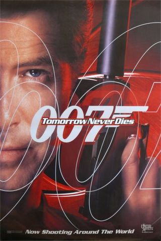
The Poster: Brosnan does his cheek-caressing thing with a gun and dares you to stop him with a steely blue eye.
Nicest Detail: The multiplied 007 motif is a nice touch.
A View To Kill (Alternative US Poster)
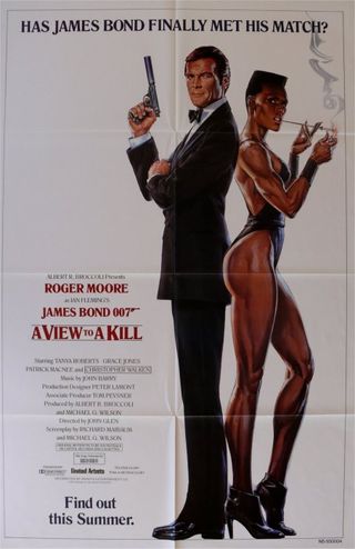
The Poster: Surely the inspiration for the Pitt vs Jolie Mr & Mrs Smith one-sheet, with Moore and Jones standing back to back on a white background.
Nicest Detail: It’s also sort of like a throwback to the original Breakfast At Tiffany’s poster (note Jones’ leggy pose and the long, thin cigarette). Except with Bond, naturally.
From Russia With Love (US Poster #1)
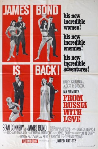
The Poster: A series of blocked-out vignettes tell us that Bond is back – and he’s still enjoying finding new ways to pose with women... and his gun.
Nicest Detail: The word ‘incredible’ just isn’t used enough on posters these days.
Casino Royale (Fan Poster #2)
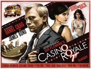
The Poster: A hand-drawn ensemble created by artist Jeff Chapman, which encompasses the pivotal, high-stakes Texas hold ‘em game.
Nicest Detail: The Daniel Craig pout is present and correct.
Licence To Kill (US Poster #2)

The Poster: Timothy Dalton clutches a rather fashionable-looking gun and stares right into our souls. That’s all we need.
Nicest Detail: The bow tie’s undone, the suit jacket’s off. This guy means business.
On Her Majestys Secret Service (Australian Poster)

The Poster: Marketing George Lazenby’s sole outing as the double-O agent – though it looks like he had fun while he was there; this poster’s positively dripping with totty.
Nicest Detail: We’re not sure it’s nice, but it sort of looks like Lazenby’s on a sunbed…
Goldfinger (US Door Panels)
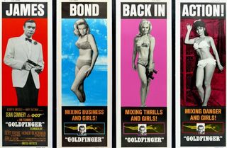
The Poster: A super-rare set that you’d have trouble buying today, these four panels essentially function as one big poster, only broken down into segments.
Nicest Detail: The fact that when united, the posters spell out the film’s tagline.
Sign up for the Total Film Newsletter
Bringing all the latest movie news, features, and reviews to your inbox
A View To A Kill (British Poster)
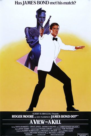
The Poster: Grace Jones looms in the background, all thrusting cleavage and tiny leotard. For some reason, she’s emerging from a pink diamond. That’s the ‘80s for you.
Nicest Detail: Roger Moore looks generally uneasy to have Ms Jones breathing down his neck. As any man would.
Dr No (US Poster)
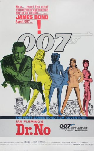
The Poster: A colourful, distinctly sixties-flavoured concoction that looks a little like something out of an old fashion mag. Guns notwithstanding.
Nicest Detail: The introductory text at the top of the poster. We can’t imagine a world where nobody knew who James Bond was. Simpler times, simpler times…
Casino Royale (US Poster)
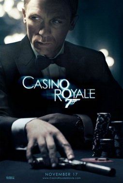
The Poster: Daniel Craig peers off-poster as he slyly reaches for his gun, making us wonder just what is going down at this particular casino table. Can’t he ever just take a night off?
Nicest Detail: The chips are stacked nice and high, letting us know this is a high-stakes game.
Josh Winning has worn a lot of hats over the years. Contributing Editor at Total Film, writer for SFX, and senior film writer at the Radio Times. Josh has also penned a novel about mysteries and monsters, is the co-host of a movie podcast, and has a library of pretty phenomenal stories from visiting some of the biggest TV and film sets in the world. He would also like you to know that he "lives for cat videos..." Don't we all, Josh. Don't we all.
Most Popular


