5 reasons hardcore gamers will love the New Xbox Experience
Avatars making you puke? Read our hands-on and don't fear the download
It's far cooler than you might think
It's unfortunate but understandable that the Avatars have grabbed the most attention out of all the NXE's new additions. You see while the grinning Mii-too cartoon characters had led many people - us included - to expect a horrible, tween-oriented, My Dashboardz abomination, NXE is actually a pretty damn classy interface.

It sounds strange when talking about something that's essentially a set of images on a 2D screen, but NXE has a really airy and expansive feel about it. While we personally have no problem at all with our beloved blades, an hour with NXE showed up just how much we didn't know we were missing. We'd never understood those who complain that the current dashboard feels clunky and crowded. Going back to it for comparison after NXE however, we now really do.
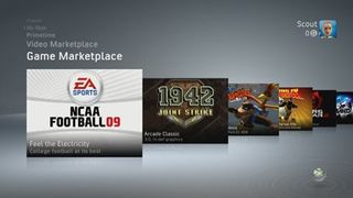
The main element responsible for that is undoubtedly the new floating windows layout. Where currently all the information related to a particular area of the Xbox 360 is crammed onto a single page and hidden behind further menus, the new windows give all of the functionality a lot more breathing space. A vertically scrolling text menu contains every sub-section - Welcome, Spotlight, the Marketplaces, Friends etc. - with each flick up or down bringing up a run of horizontally scrolling windows detailing that area's content.

The basic mechanics are clearly reminiscent of Sony's XMB, but it all feels less crowded and much more organic. With several large, graphic-oriented windows visible on screen at any given time, the featured content is arranged much more comfortably and clearly. It's like using 3D windows in Vista, except that it will actually run games. It's incredibly easy to find what you want. Much of it will be on your screen anyway.
It's all complemented brilliantly by some very modern production design. While again comparison to a rival interface - this time the Wii's - is unavoidable, once again, NXE is slicker. It's all cool colour tones and mellow ambient tunes, and although Nintendo might have got there first, Microsoft's revision feels a lot more grown up. The Wii's channel layout feels slightly toy-like in comparison, and the current dashboard now looks like someone has vomited a bag of Skittles all over the screen.
The number of video options is insane
Sign up to the 12DOVE Newsletter
Weekly digests, tales from the communities you love, and more
Whatever your TV's pixel count, NXE will look good. At the moment, those of us with an inbetween HD resolution have to put up with either downgrading to 720p or squeezing 1080p onto something that it doesn't quite fit. It doesn't cause any game-killing problems of course, but if you're a serious video snob - and believe us, we only see that quality as a good thing - then you're going to want to be outputting in your native res.
With that in mind, the limited old selection of SD, 720 and 1080 is now a distant memory. Looking into NXE's display options, we found ourselves genuinely boggled by the number of TVs and monitors now catered for. We counted at least 10 output resolutions available in the current build, so unless you're playing your 360 via a dinner plate, a set of jump leads and a magic spell, the chances are you're going to be covered.
It's addictively flickable
If you're a heavy 360 user, you know you've done it. Don't pretend you haven't. Whether waiting for a download, deciding what to play, or just looking for a viable Xbox alternative to Wii Music, you have spent time hammering on the bumpers to play a rudimentary tune with the blades' swooshing noises. So thank the good lord that we're not going to lose that little-discussed but fundamental part of 360 culture with NXE.

Not only are the blades still available through the new in-game guide - small in size but packing more features than ever before, including dynamic, current game-specific DLC links - but the bi-directional main interface means that we now have twice as many options for aurally rewarding page flicking. And with the bumpers and triggers allowing us to swoosh between both directions at the same time, there's a whole new world of dashboard composition to be had. Between the snapped-deck-of-cards sound of the horizontal windows and the cool new ambient background tunes, we're going to be retiring Rock Band when this launches.*
* This may or may not turn out to be true.**
** It probably will beat Wii Music though. We're pretty sure of that.


Gears 2, Portal: Still Alive and 360 Netflix demoed live to our game-hungry eyes

PS Home demonstrates Sony's "Mii too" approach, says Nintendo
Buy more indie games, says Balatro developer, as the roguelike card game sails past 5 million copies sold: "There's some amazing stuff out there!"
The Witcher 3 director's new vampire open-world game sure sounds like it took a page from the D&D and Baldur's Gate playbook: "Sometimes it feels like playing a paper RPG"
Most Popular
