40 Worst Movie Posters
Oh no they didn't...
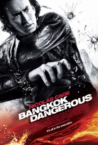
Bangkok Dangerous (2008)
The Poster: Promoting Nic Cage’s ridiculous attempt at playing a hitman who heads to Bangkok in order to carry out a job. He's a softie really, as shown when he becomes friends with an errand boy.
Worst Detail: Just what is Cage clutching? Could a gun have been removed by nervous studio bods? Certainly looks that way.
How To Make It Awesome: Put the bullet hole in the middle of Cage’s forehead.
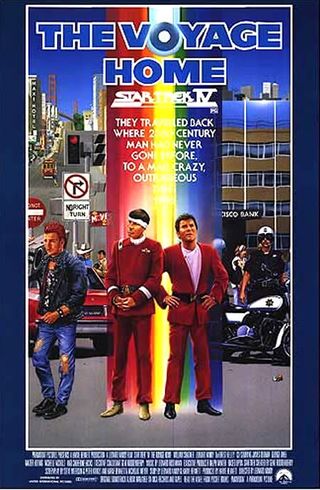
Star Trek IV: The Voyage Home (1986)
The Poster: Promoting the fourth big screen outing for the crew of the Enterprise, with Leonard Nimoy behind the camera this time.
Worst Detail: We love a good gay bar, but we’re not sure that Kirk and Spock would enjoy it quite as much. Which is a shame, as it appears they’ve just landed slap bang in the middle of San Fran's Castro district.
How To Make It Awesome: Remove rainbow. Install big, slathering monster.
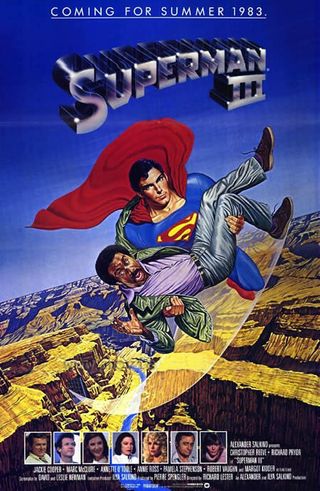
Superman III (1983)
The Poster: Promoting the third big screen adventure with Christopher Reeves as Superman. It’s the one where tobacco tar kryptonite makes him split into two people.
Worst Detail: Just… all of it. Somehow Superman doesn’t look quite so heroic when he’s saving the annoying Richard Pryor.
How To Make It Awesome: Drop Pryor into the canyon. Really. Do it.
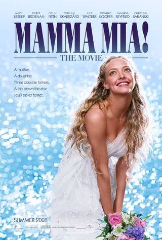
Mamma Mia! (2008)
The Poster: Promoting the sing-along tribute to Swedish pop sensation Abba, starring Meryl Streep, Christine Baranski, Amanda Seyfried and Pierce Brosnan.
Worst Detail: What is wrong with Seyfried’s neck?!
How To Make It Awesome: Turn the bouquet into some sort of Hawaiin lei to curtail our trembles of fear.
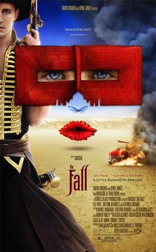
The Fall (2006)
The Poster: Promoting Tarsem Singh’s gorgeous-looking fantasy adventure, starring that chap from Pushing Daisies and following the tales of five mythic heroes.
Worst Detail: We’re all for expressionism and stuff, but this just looks silly and doesn’t come close to doing Singh’s film justice. The flower lips are particularly annoying.
How To Make It Awesome: Take any one of the sumptuous images from the film and use that instead.
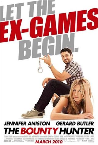
The Bounty Hunter (2010)
The Poster: Promoting the Jennifer Aniston vehicle about a – yes – bounty hunter (Gerard Butler) who is tasked with targeting his ex-wife. They go on the run together.
Worst Detail: Perspectives go wild as this photoshop effort has Butler pasted on top of Aniston. He looks positively hobbit-size in comparison.
How To Make It Awesome: Put those cuffs to good use for something a little more risque.
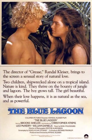
The Blue Lagoon (1980)
The Poster: Promoting that film Brooke Shields did when she was a young ‘un, as one half of a very tanned young couple stranded on a desert island.
Worst Detail: We’re all for a bit of stirring poetry, but the prose splashed across this one-sheet are just painful.
How To Make It Awesome: Write a brain-testing riddle that gives away the film’s ending – but only if you’re clever enough to decipher it.
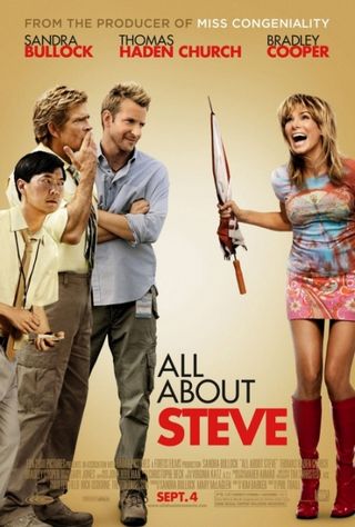
All About Steve (2009)
The Poster: Promoting the film that earned Sandra Bullock a Worst Actress Razzi – in the same year that she won the Best Actress Oscar for The Blind Side.
Worst Detail: Just dreadful photoshopping – the bane of so many terrible posters. Plus it looks like Bullock's auditioning for the new Godzilla. Badly.
How To Make It Awesome: Burn it. Burn it till it’s gone forever.

Crazy On The Outside (2010)
The Poster: Promoting Tim Allen directing himself as Tommy, a bloke recently let out of the clink and finding it difficult to adjust to life on the outside.
Worst Detail: We could do better on our Commodore 64. It’s paste crazy as Tim Allen’s head is shoved onto another bloke’s body, while a shot of Ray Liotta from GoodFellas (probably) peers through non-existent glass.
How To Make It Awesome: Remove Allen. And Liotta. And Sigourney Weaver. And leave an arty, interpretive door. Classy.
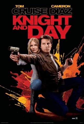
Knight And Day (2010)
The Poster: Promoting Tom Cruise’s latest attempt at being the all-American hero, this time as an unhinged chap who’s got the FBI on his tail. Also, he likes changing Cameron Diaz’s clothes while she sleeps.
Worst Detail: More blatant head photoshopping, while Cruise appears to have voided his bowls all over the wall behind.
How To Make It Awesome: Have them on a bike. Or, wait, they tried that, too. Lost cause?
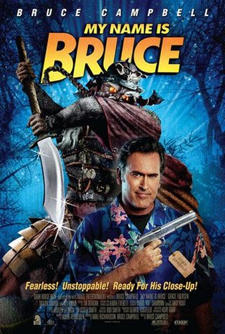
My Name Is Bruce (2007)
The Poster: Promoting Bruce Campbell directing himself as… Bruce Campbell. When he’s mistaken for his demon-slaying Evil Dead character, Bruce is enlisted to do away with a real monster.
Worst Detail: Bruce is a legend, we adore him. And this poster is clearly an attempt to draw in the B-movie-loving crowd he adores right back. Sadly, it looks like a dodgy Goosebumps cover instead.
How To Make It Awesome: All you need is Bruce. Scrap the Hawaiian shirt and the blade-wielding demon. Just Bruce. And the title. Minimalism lives.
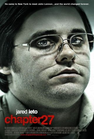
Chapter 27 (2007)
The Poster: Promoting Jared Leto getting plump and ripe to play Mark David Chapman, who we follow in the days before John Lennon is murdered.
Worst Detail: 30 Seconds To Mars fans the globe over weep at what Jared Leto has done to his face.
How To Make It Awesome: A blank poster is better than a poster with that mug on it.
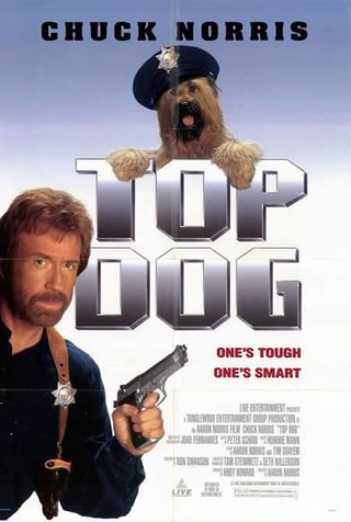
Top Dog (1995)
The Poster: Promoting Chuck Norris’ dodgy, doggy crime caper, in which his no-bullshit cop teams up with a dog police officer to hunt down terrorists.
Worst Detail: The whole thing’s all over the place, from that Top Gun -emulating title font, to the horrendous tagline…
How To Make It Awesome: Have Chuck play the dog.
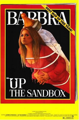
Up The Sandbox (1972)
The Poster: Promoting Barbra Streisand’s comedy that follows her bored wife and mother, who escapes from her dull New York life into outrageous flights of fancy.
Worst Detail: As if being strapped to a giant baby bottle isn’t bad enough, the artist responsible for this abomination has seriously compromised Streisand’s famous features.
How To Make It Awesome: Remove the bottle, replace it with a totally bitching rocket!
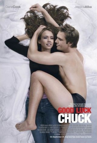
Good Luck Chuck (2007)
The Poster: Promoting this ‘comedy’ about Charlie Logan, who’s suffering a rather unfortunate curse – whichever girl he sleeps with will meet the man of her dreams soon after.
Worst Detail: He’s humping her hip! With a serial killer smirk! And she looks, well, dead !
How To Make It Awesome: Put some clothes on him, for Gawd’s sake.
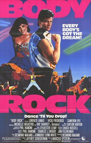
Body Rock (1984)
The Poster: Promoting the Lorenzo Lamas dramatic musical. He’s Chilly, a breakdancer who gets a big break that could turn out to be too good to be true.
Worst Detail: It’s everything that’s terrible about the ‘80s. Fads all over the place – from the painful looking dance poses to the poofy hair. And we’ve not even mentioned the dress…
How To Make It Awesome: Take it literally, and just shove a body sculpted out of rock on the poster.
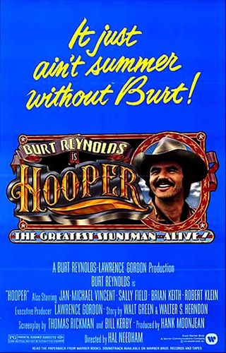
Hooper (1978)
The Poster: Promoting Burt Reynolds' action comedy, in which he plays titular stuntman Hooper, who has to keep up with the times with ever-more-dangerous shows.
Worst Detail: Blinding blue backdrop and a horror-yellow tagline. Gives us eyeburn.
How To Make It Awesome: Take a simple shot from the film as Burt enacts a terrifying, death-defying stunt.
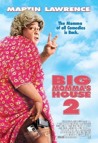
Big Mommas House 2 (2006)
The Poster: Promoting Martin Lawrence’s second attempt to girdle laughs as he cross-dresses himself into the visage of an overweight old lady.
Worst Detail: Big red writing, which is a sure warning it's seriously awful. See other terrible 'comedies' with their titles in bold red.
How To Make It Awesome: Changing up that crimson font might fool audiences. But they’re bound to be angry when they discover they’ve been duped.
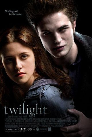
Twilight (2008)
The Poster: Promoting the first and only half decent Twilight film, as we’re introduced to lip-biting young teen Bella, who falls for cold-as-ice vamp-hunk Edward. They stare. A lot.
Worst Detail: We know Ed’s meant to be dead and all that, but he looks like something that’s just been dragged from the bottom of the Thames. Hot stuff.
How To Make It Awesome: Shove Ashley Green on the poster instead. We like the way her hair flicks.

Bleeders (1997)
The Poster: Promoting the film otherwise known as Hemogoblin , written by Alien ’s Dan O’Bannon (how the mighty fall) about a man who travels to a desert island – and finds hell.
Worst Detail: Them’s some ugly creeters.
How To Make It Awesome: Enlarge the name Rutger Hauer. That ought to do it.
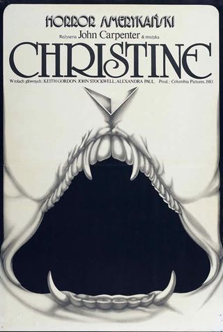
Christine (1983)
The Poster: Promoting John Carpenter’s adaptation of Stephen King’s novel. It’s about a car that possesses evil sentience.
Worst Detail: We’ll lay off being crude, but that gaping maw would be much more suited in a David Cronenberg film.
How To Make It Awesome: Car polished to perfection. Alexandra Paul draped over the hood in her Baywatch costume. Slick.
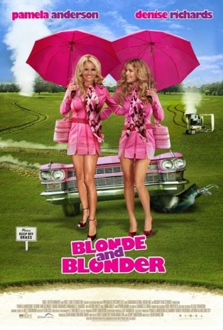
Blonde And Blonder (2007)
The Poster: Promoting Pamela Anderson and Denise Richards’ team up, in which their dim-witted blondes are mistook for international mob killers. As it goes.
Worst Detail: It’s like a young tween got set loose in the clipart factory. Golf clubs! Golf carts! Steam torrents! Then there’s the stuck-on lollipop heads. Ouch.
How To Make It Awesome: Strip everything away. Yes, everything.
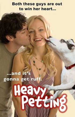
Heavy Petting (2007)
The Poster: Promoting Malin Åkerman’s hound dog comedy, in which a suitor has to get past her dog Babydoll if he wants any chance of happiness with her.
Worst Detail: That poor stuffed dog really wanted to be cremated after his untimely death. Instead, he’s used to spruce up otherwise boring posters. And given a CG tongue.
How To Make It Awesome: Ditch the mutt.
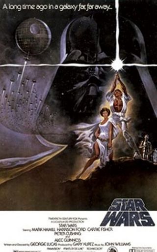
Star Wars (1977)
The Poster: Promoting the first in George Lucas’ original trilogy, as Darth Vader extends his death grip across the galaxy. Meanwhile, Luke Skywalker decides to become a Jedi.
Worst Detail: Does Mark Hamill really have a six-pack like that?
How To Make It Awesome: Get the Brothers Hildebrandt to have a crack.
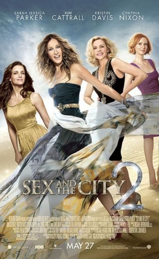
Sex And The City 2 (2010)
The Poster: Promoting the New York quartet’s big screen sequel, which sees them fly off to Abu Dhabi (for free) and basically take a big crap all over Eastern culture.
Worst Detail: Kim Cattrall is near unrecognisable after a quick brush up, while SJP is enjoying that fabric just a little too much. Nixon, happily, appears to have escaped unscathed.
How To Make It Awesome: Ditch the diamante, prada (we’re guessing) and make-up. Dress the girls down so they resemble real, sure-footed fortysomethings. Now that would be truly inspiring.
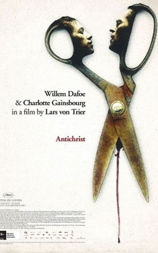
Antichrist (2009)
The Poster: Promoting Lars von Trier’s stomach-churning account of a couple’s torturous relationship as they grieve the loss of their son.
Worst Detail: Heads on scissors. And a very suggestive dribble of blood between the scissor ‘legs’. Hack sexuality. Literally.
How To Make It Awesome: Check out the other, better posters for the film.
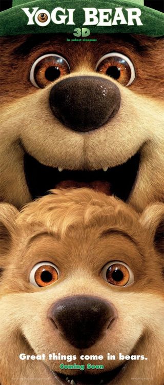
Yogi Bear (2010)
The Poster: Promoting Yogi and Boo-boo’s big screen debut as dead-eyed CGI critters who must save Jellystone Park from the town’s evil mayor.
Worst Detail: That tagline. Paired with the bears front to back. And the excited expressions. We’re still speechless months after its release.
How To Make It Awesome: It’s awesome already. In a horrible, worst-poster-ever kind of way.
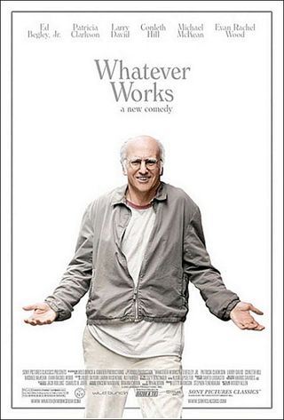
Whatever Works (2009)
The Poster: Promoting Woody Allen’s dramedy about Larry David, unfortunately named Boris. Boris likes forcing his ideologies on anyone who happens to be in the vicinity. Like that tramp in the park near your house.
Worst Detail: Lazy, boring, with Larry David looking seriously awful in an oversized outfit.
How To Make It Awesome: Surely the main pull for this film is the amazing Patricia Clarkson?
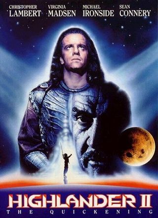
Highlander II: The Quickening (1991)
The Poster: Promoting the second in the Highlander film series, in which Christopher Lambert’s Connor MacLeod tries to save the world. Again.
Worst Detail: Poor Sir Connery appears to have a massive boil protruding from his cheek. That needs lassoing.
How To Make It Awesome: Loose the mullet and cheesy disco light effects. Add backdrop of a bloody, macho battle.
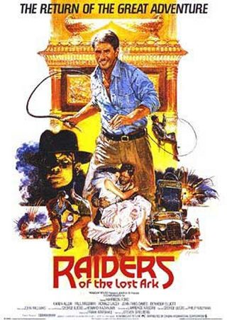
Raiders Of The Lost Ark (1981)
The Poster: Promoting Indiana Jones’ first tussle with elemental forces, as he’s hired to beat Nazis to the Ark of the Covenant. Also, he gets it on with Karen Allen.
Worst Detail: Classic hand-drawn posters are a dying breed, and far be it for us to complain about any of them. But that doesn’t even look like Harrison Ford!
How To Make It Awesome: See other, iconic Raiders art for how it should be done.
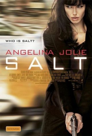
Salt (2010)
The Poster: Promoting Angelina Jolie’s new action hero adventure, as she plays a CIA agent who’s accused of being a Russian spy. Unexpectedly timely.
Worst Detail: Jolie’s post-opped cheekbones look like they could cut glass. And probably do.
How To Make It Awesome: That bit in the film where she’s all dusty and in cuffs? That’s the image you want here.
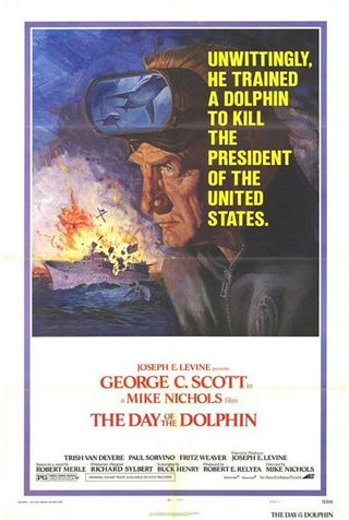
Day Of The Dolphin (1973)
The Poster: Promoting Mike Nichols’ sci-fi thriller, which follows dolphin trainer Dr Jake Terrell. Having taught his flippered trainees English, they’re kidnapped to be used in an assassination attempt. Rats.
Worst Detail: Sometimes you can be too realistic, as this poster shows. Poor George Scott has had every etch and wrinkle sketched into his portrait. Ouch.
How To Make It Awesome: Dolphins with spearguns. We’ll leave it at that.
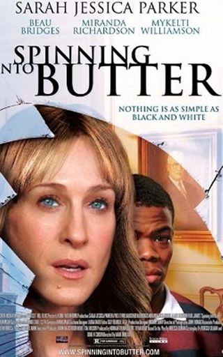
Spinning Into Butter (2007)
The Poster: Promoting Mark Brokaw’s drama about a hate crime carried out on a New England college campus. Sarah Jessica Parker plays the school’s dean (somewhat implausibly).
Worst Detail: SJP isn’t even blonde in the film. The marketing people obviously thought audiences would get confused if she appeared on the poster as a brunette.
How To Make It Awesome: Have SJP writhing around in butter. Just for comedy value.
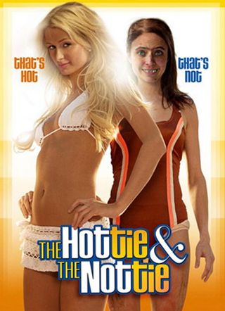
The Hottie And The Nottie (2008)
The Poster: Promoting one of the worst movies ever made – following Paris Hilton, who’s besties with a really ugly girl. Yeah. Right.
Worst Detail: Is this really called The Hottie And The Zombie ? That’s what this poster is telling us.
How To Make It Awesome: Get rid of Paris Hilton. We don’t care if she’s the star, just get rid of her.
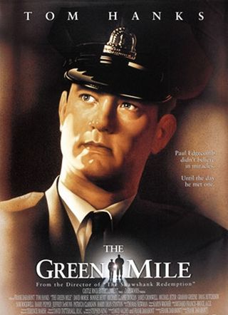
The Green Mile (1999)
The Poster: Promoting Frank Darabont’s heartbreaking adaptation of Stephen King’s novel.
Worst Detail: Clearly Tom Hanks couldn’t make it for the poster-making session, so he sent his Madam Tussauds stand-in instead. Not that anybody noticed. Right?
How To Make It Awesome: Replace Hanks with Michael Clarke Duncan as he’s clutching a teeny little mouse. Bless.
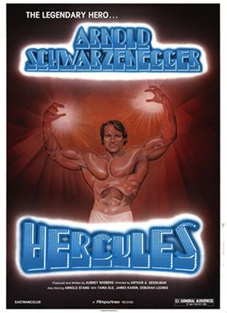
Hercules (1969)
The Poster: Promoting Arnold Schwarzenegger’s stellar (ahem) big screen debut, as his Hercules lands on Earth and starts working as a bodybuilder. As you do.
Worst Detail: Arnie looks more like Sloth from The Goonies . And appears to have a gaping cavern where his stomach should be.
How To Make It Awesome: The film’s all about Arnie’s bulging muscles, so why turn him into a cartoon? Shove a proper shot of his muscly body on the poster, instead.

One Missed Call (2008)
The Poster: Promoting the remake of 2003 Japanese film Chakushin Ari , in which people receive phone calls from their future selves, who tell them how and when they’re going to die. Handy.
Worst Detail: Screaming mouths for eyes? Really? False advertising if you ask us.
How To Make It Awesome: A blinking answering machine? An annoyed chump who’s just missed a call? Anything’s better than this.
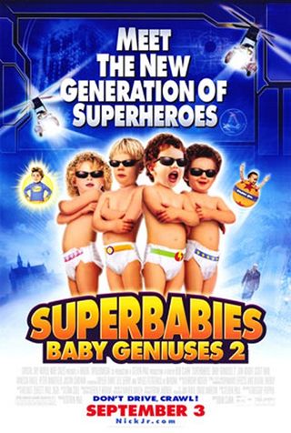
Superbabies: Baby Geniuses 2 (2004)
The Poster: Promoting the last film Bob Clark would ever direct (a shame), following a group of toddlers who discover a media mogul is attempting to decipher baby talk.
Worst Detail: The entire thing’s a bratty tragedy. Babies in shades – not cool.
How To Make It Awesome: Sorry, there’s no saving this one.
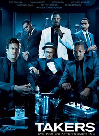
Takers (2010)
The Poster: Promoting the team up of Chris Brown, Hayden Christensen and Matt Dillon in John Luessenhop’s terrible crime thriller.
Worst Detail: Photoshopping heads onto other peoples’ bodies really should be a punishable offence. Especially when it’s as bad as this. Just look at Christensen all smug using another chap’s carcass.
How To Make It Awesome: Get rid of everybody and just leave Idris Elba. The dude abides.
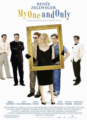
My One And Only (2009)
The Poster: Promoting Renee Zellweger’s latest comedy drama, in which her mother of two takes her sons on a road trip in the search for the perfect father.
Worst Detail: A photoshopping nightmare, this one will give any graphic designer nightmares for weeks. We doubt any of the stars lined up on this poster have ever met.
How To Make It Awesome: Start all over again.
Josh Winning has worn a lot of hats over the years. Contributing Editor at Total Film, writer for SFX, and senior film writer at the Radio Times. Josh has also penned a novel about mysteries and monsters, is the co-host of a movie podcast, and has a library of pretty phenomenal stories from visiting some of the biggest TV and film sets in the world. He would also like you to know that he "lives for cat videos..." Don't we all, Josh. Don't we all.
