40 Greatest Movie Posters
Wonderful one-sheets...
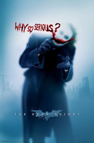
The Dark Knight (2008)
The Poster: One of several teaser posters released as part of the superlative viral marketing campaign for The Dark Knight , this sinister image of the Joker is the pick of the bunch, knocking the official burning-building image into a cocked hat.
Why So Great: “Why so serious?” is a brilliant tagline for a start, and the fact that it’s daubed in blood amps up the sense that this is going to be a distinctly adult affair. Plus, we love the tease of showing the Joker without properly revealing his face.
How Representative Of The Movie: In poster as in film, the Joker’s gruesome sense of humour is the star of the show…
Who Would Hang It On Their Wall: Banksy, a man who appreciates the effort required to disguise one’s identity.
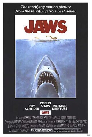
Jaws (1975)
The Poster: Nubile young swimmer versus hungry giant shark. We know who our money’s on…
Why So Great: The shark looks both massive and terrifying, but also unseen. It’s that stealthy element that makes the swimmer seem so vulnerable and what put people off going swimming for months afterwards…
How Representative Of The Movie: The horror element in which the shark picks off hapless bathers is relatively short-lived in the actual film, with most of the action coming when Roy Scheider and co. go on the hunt…
Who Would Hang It On Their Wall: A lifeguard in their beach hut. Y’know, as an ironic statement…or something.
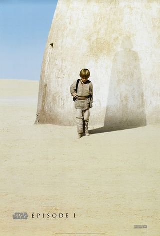
Star Wars Episode One: The Phantom Menace (1999)
The Poster: The film might never be included in any other “greatest” lists, but this teaser image of Anakin and his Vader-shadow is a masterclass in appetite-whetting!
Why So Great: It’s everything a teaser poster should be. Short on clutter, big on imagery it’s a clever way of establishing the prequel trilogy’s raison d’etre.
How Representative Of The Movie: Not even remotely. Anakin doesn’t start becoming Vader until Revenge Of The Sith , and the classy restraint of the poster is nowhere to be seen in the film. A picture of Jar-Jar defecating on an original trilogy box-set would be a fairer representation.
Who Would Hang It On Their Wall: As cool as it is, only the staunchest Lucas apologist would hang this up. And even then they’d probably keep it in the attic…
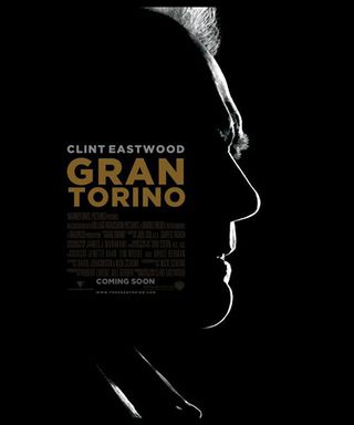
Gran Torino (2008)
The Poster: A silhouetted image of Clint’s profile, which appears to have been chiselled from granite for the occasion.
Why So Great: Clint’s squinting visage is one of cinema’s most iconic images. If Gran Torino is indeed to be his on-screen swansong, then why focus on anything else?
How Representative Of The Movie: Clint’s character is a scowling, unflinching curmudgeon…it’s remarkable how much of that comes across in this poster.
Who Would Hang It On Their Wall: We could see it hanging above the telly in a retirement home…life doesn’t have to stop once you reach your seventies!
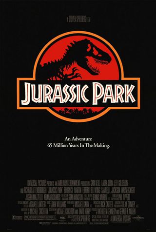
Jurassic Park (1993)
The Poster: A simple recreation of the in-film Jurassic Park logo, with a black T-Rex skeleton looming against a red background.
Why So Great: We can’t say why exactly, but there’s something more menacing about a T-Rex skeleton than if they’d used a still of the “real” T-Rex. Also, the black and red colour scheme is suitably ominous….
How Representative Of The Movie: It’s quite a low-key image considering the colourful adventure it’s promoting. However, the menace of the T-Rex is captured nicely.
Who Would Hang It On Their Wall: A palaeontologist. Who could blame them for celebrating their day in the sun?
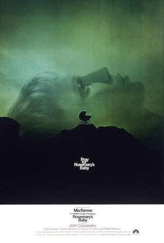
Rosemary's Baby (1968)
The Poster: A lone pram stands silhouetted against a brooding, unforgiving landscape as Mia Farrow’s stricken image looms like a sleeping giant.
Why So Great: It’s bloody chilling, that’s why. A horror movie poster should make you feel uneasy but also intrigued. This does both very effectively.
How Representative Of The Movie: You could know nothing whatsoever about Polanksi’s film and still get the gist that something horrifying resides within that pram…
Who Would Hang It On Their Wall: They should stick one on the wall of every Boots. Sales of contraception would rocket!

The Silence Of The Lambs (1991)
The Poster: A striking, monochrome image of a stunned-looking woman, with a death’s head moth obscuring her lips…creepy.
Why So Great: The presence of the moth over the girl’s mouth creates a tangible sense of violation, whilst Hannibal’s absence shows admirable restraint on the part of the studio.
How Representative Of The Movie: It makes your skin crawl, a sensation that remains ever-present as Clarice uncovers more of Buffalo Bill’s grisly handiwork. However, if you knew nothing of the plot or the subject matter, this enigmatic image might leave you scratching your head somewhat…
Who Would Hang It On Their Wall: A budding nutcase? Tread carefully if you see it in someone’s hall…
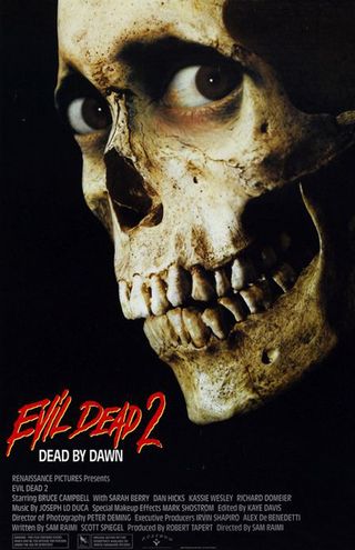
Evil Dead 2 (1987)
The Poster: Nice and simple this one…it’s a skull, with human eyes and a big old grin. All together now, “dead by dawn, dead by dawn!”
Why So Great: It perfectly sums up the film’s blend of horror and comedy, the human eyes lending the skull a grotesque but humorous look that captures the movie’s offbeat vibe to a tee. Although we could have done with a little Bruce in there too…
How Representative Of The Movie: As we said, it sums it up perfectly. Funny, scary and cool.
Who Would Hang It On Their Wall: A supermarket worker looking for something to aspire to…“shop smart, shop S-Mart!”
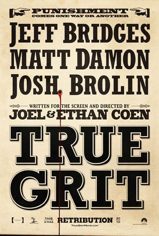
True Grit (2010)
The Poster: A mocked-up wanted poster listing the principle cast and stressing the movie’s key theme…retribution.
Why So Great: It just looks badass from top to toe. We particularly like the slogan, “punishment comes one way or the other”, whilst the bleeding bullet hole is just the icing on the cake.
How Representative Of The Movie: True Grit is a pitch perfect recreation of the classic Westerns of old, and feels every bit as authentic as this period teaser.
Who Would Hang It On Their Wall: Imagine seeing this in a courtroom. You wouldn’t put money on the defendant getting off, would you?
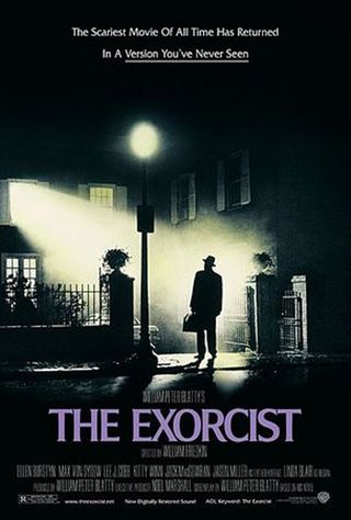
The Exorcist (1973)
The Poster: William Friedkin’s supernatural chiller sets its stall out nice and plainly, as Max Von Sydow’s man of God stands outside the foreboding MacNeil household.
Why So Great: The exorcist is stopped in his tracks, framed in a ghostly pall of mist, as if contemplating whether or not to go any further. It nicely mirrors the feelings of the cinemagoer, simultaneously intrigued and frightened by what they’re about to experience…
How Representative Of The Movie: Very. It captures the sense of dread perfectly. And they couldn’t very well slap a picture of the crucifix scene on the poster, could they?
Who Would Hang It On Their Wall: If a copy appears on your daughter’s wall, get the clergy on the phone, sharpish.
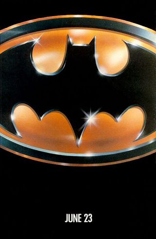
Batman (1989)
The Poster: It’s the ultimate teaser poster…just the bat symbol and a date. What more do you need to know?
Why So Great: A triumph of minimalism, by just releasing an image of the batman logo, Warner managed to whip fans into a state of frenzy without giving any details away. Pretty smart…
How Representative Of The Movie: Well, Batman is in it, so we’d say it’s pretty accurate!
Who Would Hang It On Their Wall: Michael Keaton, Christian Bale…Val Kilmer at a push. We can’t imagine Clooney’s got one on the wall though…

Pulp Fiction (1995)
The Poster: Uma Thurman practices her best come-to-bed expression in QT’s seminal Pulp Fiction poster. Timeless stuff.
Why So Great: We love the way it’s designed to represent one of the eponymous trash-books, whilst Uma ensures that smoking has never looked sexier.
How Representative Of The Movie: Sexy, smart and above all, cool. That pretty much sums the film up to a tee…
Who Would Hang It On Their Wall: The more discerning teenage boy, for whom Kelly Brook is a bit too obvious.
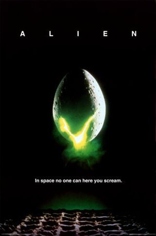
Alien (1979)
The Poster: A hatching egg emits an ominous green glow, as the definitive sci-fi image is born…
Why So Great: The image itself is very striking, but it’s the tag-line that makes it. “In space noone can hear you scream” has entered our cultural lexicon for a reason…
How Representative Of The Movie: It manages to encapsulate the movies blend of traditional science-fiction, with body-horror ickiness. There’s something about a hatching egg that’s a little gross at the best of times…
Who Would Hang It On Their Wall: Ponytail-sporting fanboy types, many of whom will be able to boast a t-shirt to match.
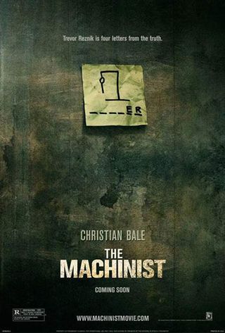
The Machinist (2004)
The Poster: A moody one-sheet showing the taunting post-it note that haunts poor Christian Bale…
Why So Great: It’s intriguing enough to pique your interest without spilling any of the movies manifold secrets. When it comes to poster art, less is often so much more.
How Representative Of The Movie: The dank, dirty colour scheme reflects the film’s washed-out look perfectly.
Who Would Hang It On Their Wall: Anyone on the Slim-Fast plan. It’s amazing what you can achieve when you set your mind to it…
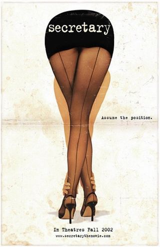
Secretary (2002)
The Poster: A lascivious, lingering shot of Maggie Gyllenhaal’s shapely backside. Calm down everyone…
Why So Great: Okay, so it’s more than a little pervy, but given the subject matter, that’s probably fairly appropriate. And there’s a wonderful symmetry to the image…oh who are we kidding?
How Representative Of The Movie: Shocking, exploitative, shamelessly titillating…all of which are themes that are explored within the movie itself.
Who Would Hang It On Their Wall: Somebody who is unmarried, most likely.
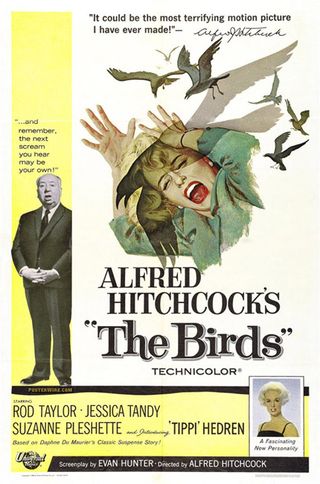
The Birds (1963)
The Poster: A luckless female comes in for a right old pecking as Hitch watches on impassively. “It could be the most terrifying motion picture I have ever made,” he says helpfully.
Why So Great: Whacking Hitchcock on the poster might be a bit naff, but there’s no arguing with the lead image. On the face of it, a film about killer birds might sound a bit daft, so props to the art team for making this one look appropriately scary…
How Representative Of The Movie: The feathered fiends are at their most distressing when descending en masse, and the main image does a good job of evoking that sense of frenzy.
Who Would Hang It On Their Wall: We can imagine Bill Oddie furtively hanging this above his bed. *Shudders*…
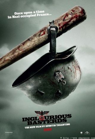
Inglourious Basterds (2009)
The Poster: A typically grisly promo poster in which a bloodied Nazi helmet hangs from the baseball bat of Donnie Donowitz…
Why So Great: The tagline is ace, and the level of detail on display here is pretty staggering. We love the fact that the names of various dead Jews to be avenged are legibly etched into the distinctly worn-looking bat…
How Representative Of The Movie: Down, dirty and violent, with a touch of fairytale magic thrown in for good measure…it’s a perfect fit for QT’s WW2 fantasy.
Who Would Hang It On Their Wall: Any right-thinking individual with a loathing for all forms of national oppression. And your common or garden gorehound…
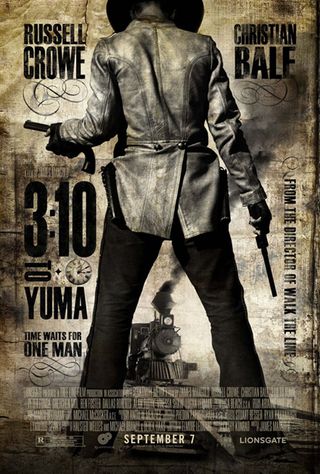
3:10 To Yuma (2007)
The Poster: A gloriously old-school offering in which a gunslinger stands confrontationally in front of the eponymous locomotive.
Why So Great: There’s nothing like a good old-fashioned Western poster, and this one looks almost biblical in its bristling masculinity! The grimy colouring sets things off a treat.
How Representative Of The Movie: Any film that accommodates both Christian Bale and Russell Crowe is going to be packing a fair amount of testosterone, and this poster gives you some idea of how much to expect!
Who Would Hang It On Their Wall: We like to imagine this sort of thing covering every square inch of Sam Elliott’s abode…
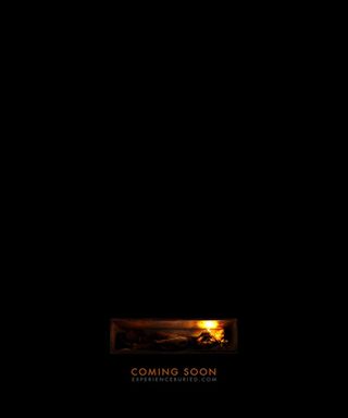
Buried (2010)
The Poster: A horribly claustrophobic poster featuring Ryan Reynolds in a coffin, way, way below the earth.
Why So Great: It gets the job done with minimalist flair, more or less explaining the set-up without expending a single word. Thrifty.
How Representative Of The Movie: The perfect representation. It’s Ryan Reynolds in a box…and that’s it!
Who Would Hang It On Their Wall: It would serve as a handy safety reminder at an undertakers. Rule one: check they’re definitely dead…
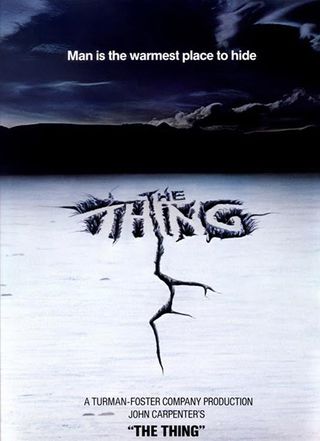
The Thing (1982)
The Poster: A desolate arctic vista, under which something is stirring. Hold on to your hats….
Why So Great: The one featuring an arctic explorer is probably more famous, but there’s something deeply unsettling about this secondary poster. The cracks that form the title are so jagged and violent you just know things aren’t going to end well.
How Representative Of The Movie: Carpenter’s gory sci-fi is every bit as rugged and uncompromising as this stark poster. As is Kurt Russell…
Who Would Hang It On Their Wall: Hopefully Matthijs van Heijningen Jr. has one on his office wall as a reminder of what his prequel has to live up to…
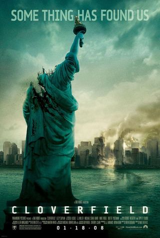
Cloverfield (2008)
The Poster: J.J. Abrams’ mysterious monster movie makes a bee-line for your sense of curiosity with this enigmatic image of a decapitated Statue of Liberty.
Why So Great: The first poster image contained no information at all, but this primary one-sheet includes the tantalising “some thing has found us”. Note the odd spacing between some and thing…it’s a small detail, but further evidence of Abrams’ grand plan to wrong-foot his audience at every turn…
How Representative Of The Movie: The sense of mystery is heavily flagged up here, but you also know you’re going to be in for plenty of action. Why? Because the Statue of Liberty has lost its bloody head!
Who Would Hang It On Their Wall: Either a sci-fi enthusiast or a sworn enemy of Western civilisation. One of the two…
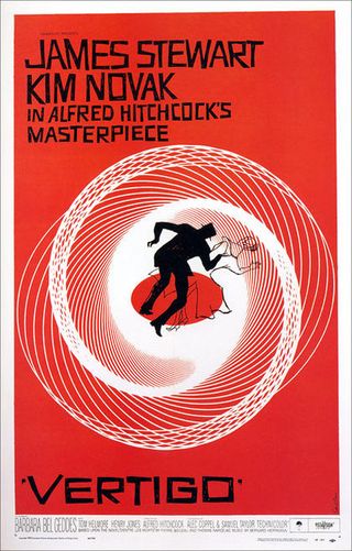
Vertigo (1958)
The Poster: A poster that’s every bit as iconic as the film itself, Saul Bass’s dizzying design for this Hitchcock classic is a seminal piece of movie art, the sort of thing you might have on your wall regardless of whether you’d seen it or not!
Why So Great: A pair of shadowy figures, caught in the midst of a vortex of circumstances that are swiftly spinning out of their control…it’s a visual representation of Hitchock’s entire oeuvre.
How Representative Of The Movie: Very much so. Note how the Novak figure appears almost totally limp, whilst Jimmy Stewart’s avatar is beginning to lose his footing by trying to hold on to her. That’s deliberate…
Who Would Hang It On Their Wall: Anyone with a love of movies extending beyond the Twilight saga…
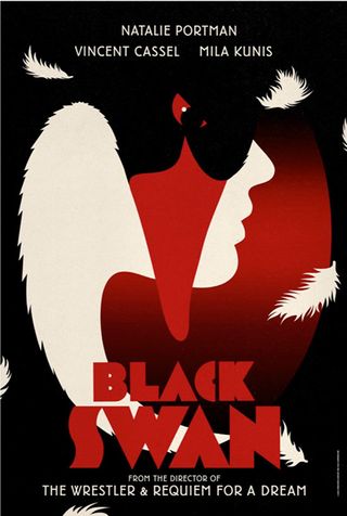
Black Swan (2010)
The Poster: One of four specially commissioned posters designed by British studio LaBoca to celebrate Darren Aronofsky’s balletic psychodrama, all of which are vastly superior to the one of Natalie Portman with the broken face.
Why So Great: We love the nostalgic, Eastern European sensibilities on display here, as well as the way in which the swan and the dancer bleed into one.
How Representative Of The Movie: The identity crisis theme is well represented here, as is the general sense of menace. That is one mean-looking swan…
Who Would Hang It On Their Wall? Twinkle-toed luvvies everywhere, as a handy reminder not to go mad.
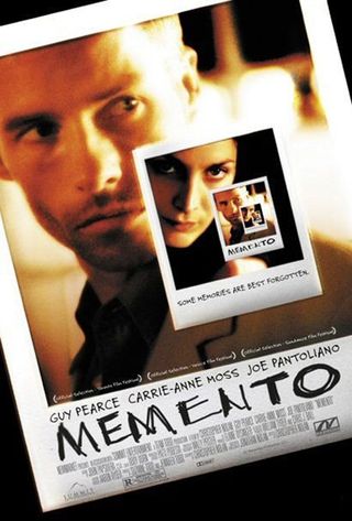
Memento (2000)
The Poster: A Polaroid within a Polaroid within a Polaroid, as Guy Pearce and Carrie-Ann Moss attempt to unravel Christopher Nolan’s meticulously plotted mystery.
Why So Great: It cleverly captures the movie’s ingenious framing mechanism, whilst also hinting at the story’s dark denouement with the foreboding tagline, “some memories are best forgotten…”
How Representative Of The Movie: Extremely, in the sense that the story unravels in layers, and you’re never quite sure what truth lies at the bottom of it. Staring at an infinite number of self-contained images is equally bemusing!
Who Would Hang It On Their Wall? Guy Pearce’s character himself could do with a copy in his room, heavily annotated of course…
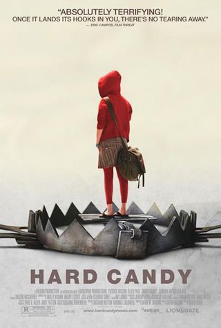
Hard Candy (2005)
The Poster: A vulnerable-looking Red Riding Hood-alike stands atop a primed man-trap to promote David Slade’s hard-hitting drama…
Why So Great: It takes several glances to realise that the little girl isn’t caught in the trap, she’s bait…plus, intentional or not, the comparisons with Don’t Look Now also crank up the shiver factor.
How Representative Of The Movie: The contrasting images of innocence and danger sets the scene perfectly for the provocative subject matter at the film’s heart.
Who Would Hang It On Their Wall: Every parent should mount one of these in their child’s bedroom to ward off sexual predators…
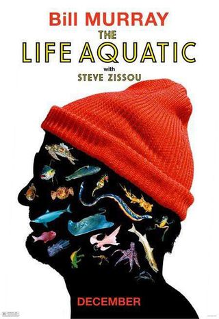
The Life Aquatic With Steve Zissou (2004)
The Poster: Bill Murray’s ugly mug appears in profile, but with all his features replaced by the denizens of the ocean. Nice hat though
Why So Great: It just makes us laugh, particularly given that you can still make out it’s Bill Murray despite his fishy disguise. It also looks vaguely French, in an off-beam, arty sort of way.
How Representative Of The Movie: It totally conveys the wilfully silly tone of the movie, whilst also hinting at Zissou’s more fundamental sense of melancholy. And there are lots of fish in it, obviously.
Who Would Hang It On Their Wall: Anderson apologists such as ourselves, and Captain Birdseye.

Brick (2005)
The Poster: Emilie De Ravin’s lifeless hand lies draped in a veil of rainwater in this beautifully illustrated teaser for Rian Johnson’s teen noir.
Why So Awesome: It’s nice and low-key, giving very little obvious away, and yet also manages to cram in quite a bit of info into one image. We know a girl has been killed, the film will seek to get to the bottom of it, and we’re not in for a traditional Hollywood experience…more than enough to whet the appetite!
How Representative Of The Movie: The more hard-boiled elements aren’t on display, but the amount of fragile beauty conjured up by a single wrist is most impressive. Already we want to know who could have done something so awful.
Who Would Hang It On Their Wall: Wannabe Bogeys everywhere…
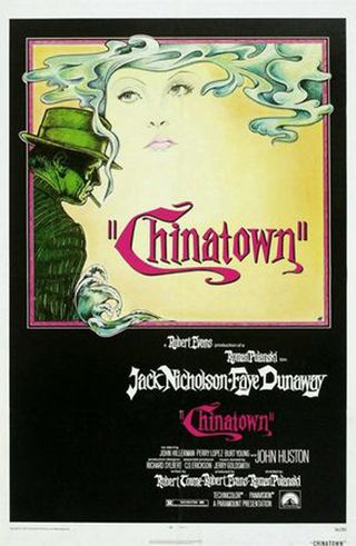
Chinatown (1974)
The Poster: Polanski’s crime opus gets a suitably moody treatment with this poster that practically screams, “YOU ARE WATCHING A DETECTIVE MOVIE!”
Why So Awesome: It’s a glorious throwback to the classic pulp fiction detective novel, complete with scowling gumshoe, melancholy dame and a fug of cloying cigarette smoke.
How Representative Of The Movie: In actual fact, it probably undersells the movie to a certain extent, in that Nicholson’s Jake Gittes has a bit more about him than the traditional dime-store private dick. Still, in terms of establishing the general tone, it does its job well.
Who Would Hang It On Their Wall: Rian Johnson probably had one in his bedroom somewhere…
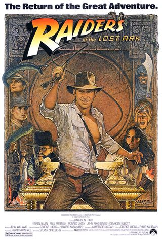
Raiders Of The Lost Ark (1981)
The Poster: A swashbuckling, action-packed affair proclaiming, “The Return Of The Great Adventure.” That’s some big talk right there…
Why So Awesome: It’s a proper Boy’s Own affair isn’t it? Dastardly Nazis, a startled dame, a tableau of some of the movie’s more exciting scenes…and of course, our whip-cracking hero holding sway over all.
How Representative Of The Movie: It captures the original trilogy’s breathless sense of fun perfectly. The tagline might look excessively grandiose on any other movie, but in this case, it’s a claim that can’t be disputed!
Who Would Hang It On Their Wall: We can only hope that Shia LaBoeuf weeps into his every night…
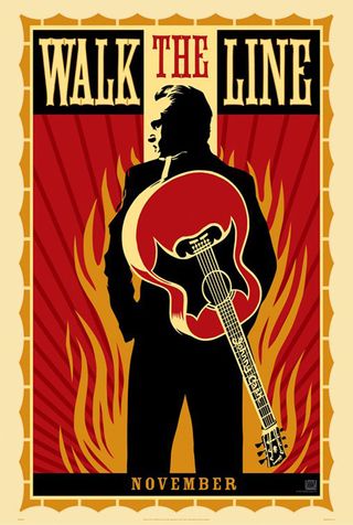
Walk The Line (2007)
The Poster: It’s block colours ahoy in this excellent poster from Obama’s favourite designer, Shepard Fairey.
Why So Awesome: Apart from the uber-trendy design aesthetic, we love the level of detail involved here, from the Ring Of Fire -referencing flames to the Johnny Cash signature on the guitar’s neck. Oh, and any poster that has the star facing away from the viewer is automatically just that little bit cooler.
How Representative Of The Movie: Well, it looks authentically ‘60s for a start, and then there’s Joaquin’s expression…this isn’t selling the movie as any sort of happy-go-lucky jaunt, and nor should it.
Who Would Hang It On Their Wall: Joaquin’s agent should have this on prominent display in his office next time he sees his client. Somebody, please get him back doing proper films!
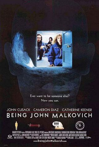
Being John Malkovich (1999)
The Poster: The traditional Malkovich artwork gets a sci-fi overhaul in this brilliant alternative poster.
Why So Awesome: The one with all the Malkovich masks might be more striking, but this one plain rocks. The four mini-images below the title, serving as a kind of rudimentary diagram to the film’s plot, are particularly excellent.
How Representative Of The Movie: Very, in the sense that the film’s fantasy leanings are more clearly spelled out here than in the main poster. Cameron Diaz’s make-under is also on full display.
Who Would Hang It On Their Wall: Wannabe indie auteurs and borderline schizophrenics.
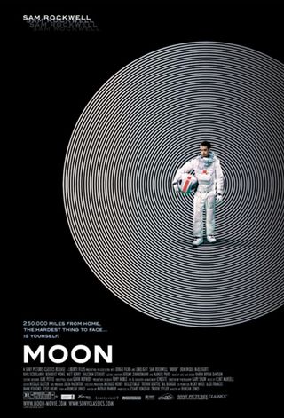
Moon (2009)
The Poster: Duncan Jones’ tale of space-based isolation gets some suitably stark artwork.
Why So Awesome: It’s beautifully uncluttered for a start, which helps in conjuring up a sense of loneliness. And then there’s the hypnotic disc behind Sam Rockwell, doubling up as both the moon and his increasingly bewildered state of mind. Lovely stuff.
How Representative Of The Movie: Arty, mournful and vaguely threatening…all of which could be said about the movie itself.
Who Would Hang It On Their Wall: An ageing hippy could place it next to their Ziggy Stardust print. Like father like son…sort of.
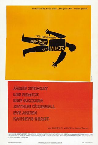
Anatomy Of A Murder (1959)
The Poster: Another classic from Saul Bass, this time to promote Otto Preminger’s courtroom drama.
Why So Awesome: Bass’s pared-down graphics are always pretty special, and we like the literal approach of breaking up a corpse into its constituent parts. Who knew a dismembered body could look so jaunty?
How Representative Of The Movie: In the same way that the poster keeps things simple, Anatomy Of A Murder has been hailed as being one of the purest trial movies ever made. However, with a Duke Ellington soundtrack and a Bass-designed title sequence, it’s also very cool.
Who Would Hang It On Their Wall: Spike Lee must have one. Take a look at the poster for Clockers if you don’t believe us…

American Beauty (1999)
The Poster: A fleshy expanse promotes Sam Mendes’ directorial debut, with the movie’s signature rose imagery taking a prominent role.
Why So Awesome: We love how the enigmatic tagline is embodied by the poster’s extreme close-up, whilst the general air of understatement is impressively restrained. And compositionally speaking, it’s also pretty sound, with the belly button sitting dead centre on the page…not that we’re nerds or anything.
How Representative Of The Movie: Innocence meets eroticism…it pretty much nails one of the key themes of the movie.
Who Would Hang It On Their Wall: An “art” enthusiast. At least it’s more subtle than an Athena poster!
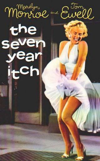
The Seven Year Itch (1955)
The Poster: One of Hollywood’s most famous images. You could be forgiven for forgetting there’s a film attached…
Why So Awesome: Well, besides the obvious, the lower-case title and swirly cast-listing hint at the movie’s general sense of joie de vivre. And then there’s the obvious...
How Representative Of The Movie: In the sense that Billy Wilder’s film will always be remembered for providing one of the twentieth century’s most enduring images, it represents it pretty well!
Who Would Hang It On Their Wall: Adoring teenage girls and leering teenage boys alike.

Metropolis (1927)
The Poster: An arty, sketch-based piece to promote Fritz Lang’s classic sci-fi adventure.
Why So Awesome: It’s an exercise sepia toned, angular perfection. Very few movie posters would look the part hanging in a gallery, but this 1920’s masterpiece would feel right at home.
How Representative Of The Movie: It captures both the audience’s sense of wonder and nagging feelings of unease perfectly.
Who Would Hang It On Their Wall: A sci-fi connoisseur, next to their bookcase full of Philip K. Dick tomes.
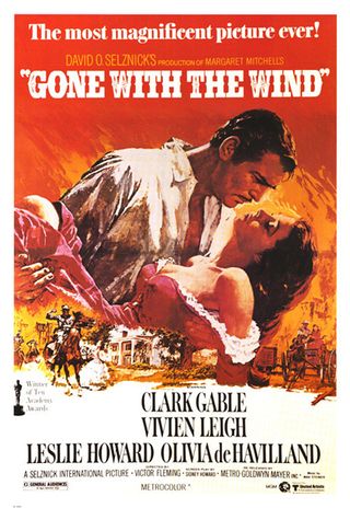
Gone With The Wind (1939)
The Poster: Clark Gable sweeps Vivien Leigh of her feet in this classic promo for the definitive epic romance.
Why So Awesome: It’s very difficult to convey raw passion in a still image, but this poster pulls it off admirably, the flaming backdrop just about matching the intensity in Gable’s stare. Phew!
How Representative Of The Movie: Very. The romance is intense, and the poster backs that up by coming off like an action movie!
Who Would Hang It On Their Wall: Old romantics, lovers of the classics and the odd pyromaniac.
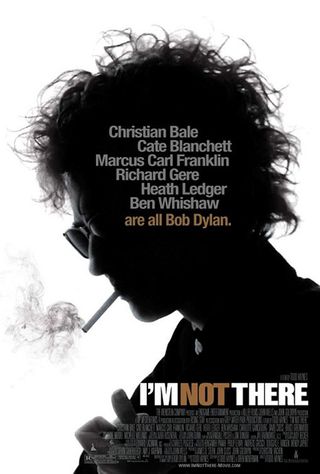
I'm Not There (2007)
The Poster: A silhouetted image of Cate Blanchett as Bob Dylan. Stunt casting at its finest.
Why So Awesome: The use of the most surprising cast member grabs the attention, but it’s also a pretty cool image on its own merits. We also like the way the movie’s high-concept casting is spelled out in the tagline…
How Representative Of The Movie: You couldn’t really claim you didn’t know what you were going to watch having seen this!
Who Would Hang It On Their Wall: An indie scenester, most of whom could use this instead of a mirror.
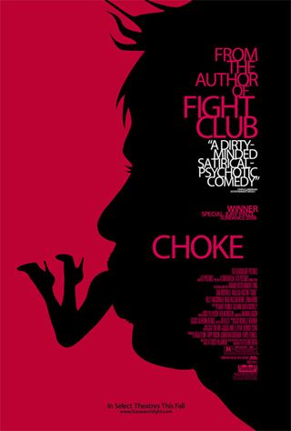
Choke (2008)
The Poster: A typically quirky image to go with a typically quirky tale from the pen of Chuck Palahniuk.
Why So Awesome: It looks like something from the opening credits of a Bond film! Plus, the colour scheme is pleasingly bold, and the use of silhouettes is always a winner.
How Representative Of The Movie: It certainly captures the off-kilter mood, although we must clarify that Sam Rockwell doesn’t actually eat any women in the film.
Who Would Hang It On Their Wall: Someone with some very bizarre sexual fantasies. In fact, this would sit nicely in a psychologist’s waiting room.
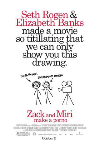
Zack And Miri Make A Porno (2008)
The Poster: A chucklesome doodle knocked up to protect our poor unsuspecting eyes from any horrid nudity.
Why So Awesome: It’s a clever idea, and one that never fails to raise a smile. We particularly like Seth Rogen’s Jewfro…
How Representative Of The Movie: As likeable as it is, the finished article isn’t quite as funny as this witty artwork would have you believe.
Who Would Hang It On Their Wall: Good, God-fearing folks who don’t want to get in the big fella’s bad books by looking at something they shouldn’t.

George was once GamesRadar's resident movie news person, based out of London. He understands that all men must die, but he'd rather not think about it. But now he's working at Stylist Magazine.
