40 Greatest Horror Movie Posters
Scary one-sheets to give you the shivers
Creepshow (1982)
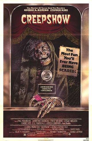
Representative Of The Film? Riffing on classic E.C. Comics visual, this hints at the film’s skewed wit and anthology format by suggesting you’ll get plenty of bang for your buck.
Coolest Detail: Impressively meta, so much so that cinemagoers must have been disappointed to be served by a surly teenager rather than the poster’s apparition.
Q: The Winged Serpent (1982)
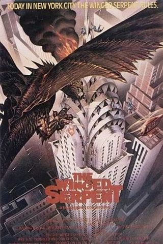
Representative Of The Film? The gorgeous art-deco poster takes its cue from the Chrysler Building, central to the plot, but the film is pure cheap ‘n’ cheerful 80s-ness.
Coolest Detail: The soldiers falling off the spire of the skyscraper.
The Evil Dead (1981)
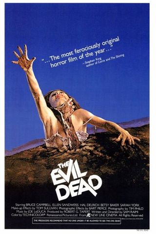
Representative Of The Film? Strangely, no. It’s a frightening pose, but the film is both nastier and funnier in its surreal imagery.
Coolest Detail: If you’ve got to have a quote on the poster, it may as well come from horror’s most famous name.
Bunny Lake Is Missing (1965)
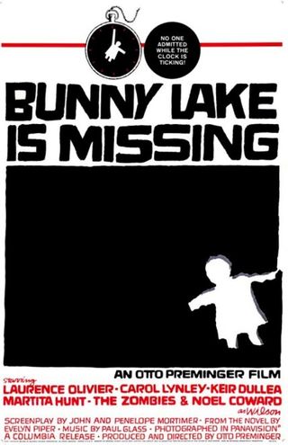
Representative Of The Film? Graphic design genius Saul Bass specialised in translating narrative into abstract concepts that epitomised the film while giving nothing away. This one’s particularly haunting.
Sign up for the Total Film Newsletter
Bringing all the latest movie news, features, and reviews to your inbox
Coolest Detail: Stealing a trick off Psycho , “no one admitted while the clock is ticking!”
The Fly (1986)
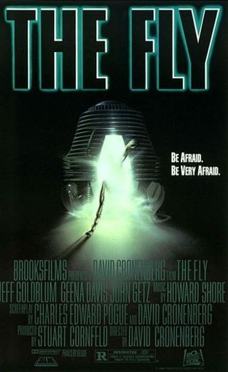
Representative Of The Film? The human arm and insectoid leg combo is a bit of a cheat, but the clinical simplicity of showing only the matter transmission pod underlines that this is a very different beast to the schlocky '50s original.
Coolest Detail: The tagline... which, unusually, isn't a marketing man's come-on but a direct quote from the screenplay.
Saw 3 (2006)
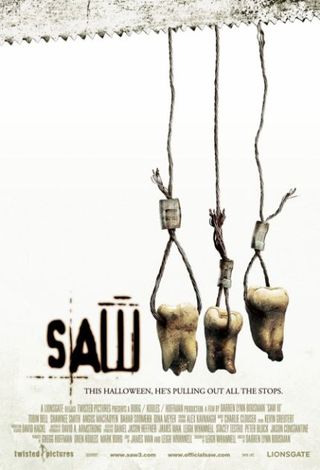
Representative Of The Film? The malicious, minimalist wit of the Saw posters remains a masterclass in psychology, hinting at untold torture porn terrors within.
Coolest Detail: The use of a pure white background points out that, actually, those teeth are looking pretty grubby.
Funny Games (2008)
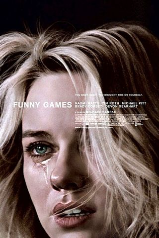
Representative Of The Film? Michael Haneke had a decade to think about marketing the second version of his cruel, austere anti-horror, so no wonder that this memorably disconcerting anti-poster works so well.
Coolest Detail: The disruptive placement of the credits.
The Thing (1982)
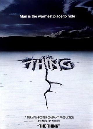
Representative Of The Film? A subtle cheat, as the ice-bound setting and the cryptic tagline don't give away nearly how weird this film is.
Coolest Detail: The ‘i’ of the title has been formed differently from the letters around it – a neat subliminal hint of the Thing’s shape-shifting abilities.
The Eye (2008)
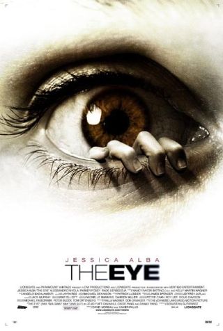
Representative Of The Film? Not really. There’s nothing on-screen to match the crawling Bunuellian horror of this invasive image.
Coolest Detail: The lack of a space in the title makes it look like the film is called Theeye ...which is the sound you’d probably make if a hand tried to call out of your eye socket.
Possession (1981)
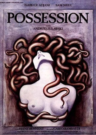
Representative Of The Film? Monstrous sex is certainly at the heart of events. The chalk-drawn stylings are an odd choice for a movie whose on-screen style is clinical and modern, though.
Coolest Detail: That sneaky snake’s tail slithering down to the nipple. Naughty, naughty.
