40 Greatest Horror Movie Posters
Scary one-sheets to give you the shivers
Suspiria (1977)
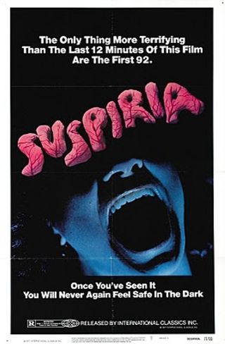
Representative Of The Film? Nothing could hope to match up to the scientific exactitude of this poster’s boast. For starters, what about the bit with the wire in the middle of the film?
Coolest Detail: The fact that somebody decided to compose the title out of candyfloss is the most terrifying thing of all.
Silent Night Deadly Night (1984)
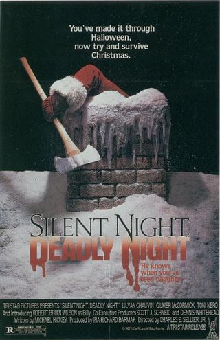
Representative Of The Film? Yes, in all its sick and twisted glory. A little too close to home for the multiplex, though – this got pulled after parents complained that their kids were terrified.
Coolest Detail: It takes a certain amount of bravado – or stupidity – to bury your best tagline in the corner.
Frankenstein (1931)
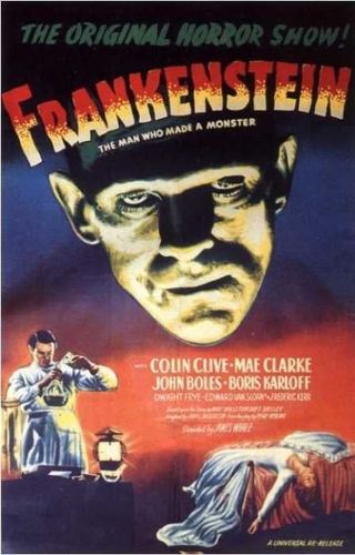
Representative Of The Film? Remarkably even-handed. The bottom half warns of the film’s slightly dull melodramatic core...but the still-startling appearance of the creature makes the film unmissable.
Coolest Detail: The greatness of this one is all about Boris Karloff.
The Stuff (1985)
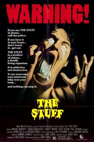
Representative Of The Film? Arguably too much. That ‘Warning’ at the top may as well have the word ‘Spoiler’ stuck in front of it.
Sign up for the Total Film Newsletter
Bringing all the latest movie news, features, and reviews to your inbox
Coolest Detail: The fact that THE STUFF is capitalised throughout.
I Walked With A Zombie (1943)
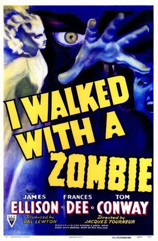
Representative Of The Film? Producer Val Lewton’s movies were always more suggestive and psychological than their attention-grabbing poster and this – a sort-of adaptation of Jane Eyre – is no exception.
Coolest Detail: Jelly-wobble lettering on the word ‘Zombie.’
Halloween (1978)
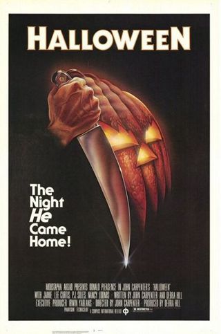
Representative Of The Film? Pumpkin, yes. Carving knife, definitely. But the implication that it’s about a pumpkin-masked killer is a massive red herring.
Coolest Detail: That “He” in the tagline is incredibly intriguing.
The Curse Of The Werewolf (1961)
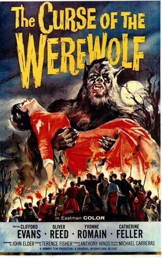
Representative Of The Film? The lurid, splashy colours of Hammer posters always synced up nicely with the bloody on-screen imagery, nowhere more so than here.
Coolest Detail: The fact that it looks like the werewolf is going to crush a tiny mob by dropping a giant lady onto them.
Dawn Of The Dead (1978)
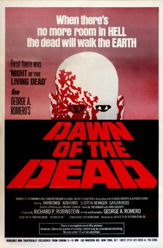
Representative Of The Film? Everybody knows this one as “the one in the shopping mall.” There isn’t a hint of retail about this poster.
Coolest Detail: The head rising over the horizon is a literal depiction of the dead’s “dawn.”
House (1986)
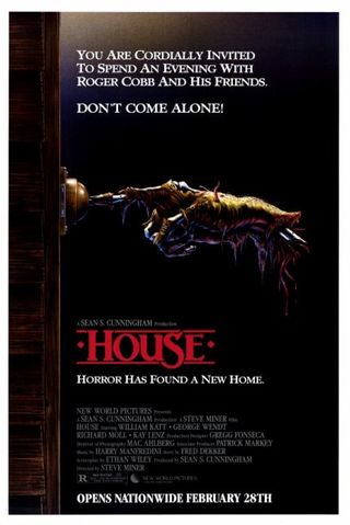
Representative Of The Film? A ghoulishly funny spin on the horror poster standard of the severed/skeletal hand, this is a great conceptual teaser for Steve Miner's scary/funny movie.
Coolest Detail: The parody of a house party invitation.
House On Haunted Hill (1959)
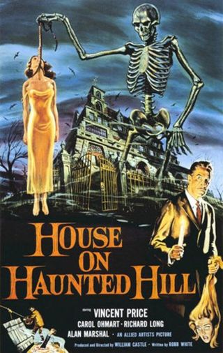
Representative Of The Film? Somebody’s got carried away making this…but it’s that very OTT, over-busy feel that encapsulates the funhouse atmosphere of William Castle’s
Coolest Detail: The look on the skeleton’s face, as if he’s disgusted by human flesh and on the verge of chucking the corpse in the bin.
