30 Terrible 2010 Movie Posters
Bad little art monkeys
Burlesque
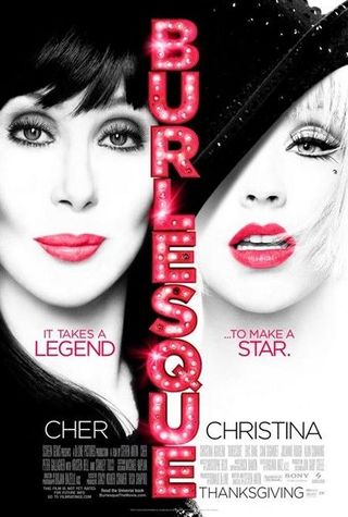
The Terrible: Cher and Christina Aguilera wrestle for poster space. Can Cher really still claim to be a ‘legend’?
Worst Detail: With that horrible, unflattering white-out, the poster designers attempt to make Cher less creepy – but she ends up looking like a drag version of the Scream mask.
Next: When In Rome [page-break]
When In Rome
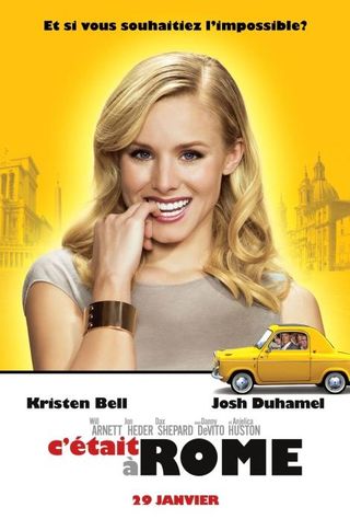
The Terrible: Kristen Bell looks just as uncomfortable to be on this poster as we are looking at it.
Worst Detail: Horrible custard colouring, a weird aura glow around Bell, and a ridiculous car stuffed with the rest of the films 'stars'. Épouvantable .
Next: Paper Man [page-break]
Paper Man
Sign up for the Total Film Newsletter
Bringing all the latest movie news, features, and reviews to your inbox
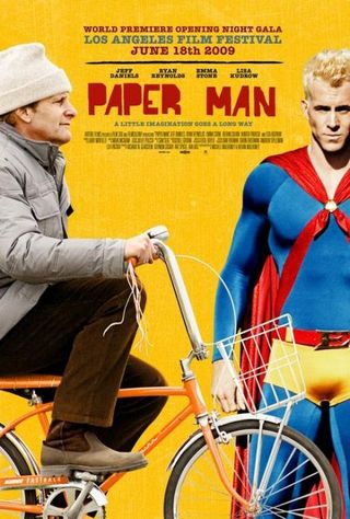
The Terrible: Two characters from the film shoved together on the same one-sheet. With no flow or poetry. Eye-catching pants, though, Ryan.
Worst Detail: Daniels is wrapped up for winter while Reynolds stands in the dazzling sunlight. Pick a season and stick with it, people.
Next: Salt [page-break]
Salt
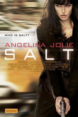
The Terrible: Yes, it made the cover of our brilliant re-design issue, but it’s still a crummy image.
Worst Detail: Angelina Jolie no longer looks like Angelina Jolie. You can almost see the photoshop brush strokes.
Next: Daybreakers [page-break]
Daybreakers
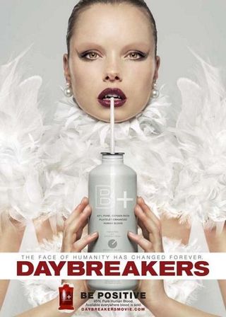
The Terrible: Clearly attempting to ride the True Blood bandwagon, the marketing people for Daybreakers get punny with it, turning a blood type into a catch phrase. It sucks.
Worst Detail: We know the film’s meant to be scary, but seriously - what’s wrong with that model’s face?
Next: Alice In Wonderland [page-break]
Alice In Wonderland
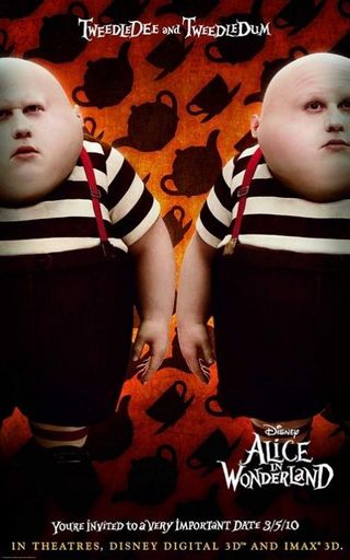
The Terrible: Matt Lucas gets cloned as Humpty Dumpty, sorry, TweedleDee and TweedleDum. He looks like Uncle Fester gone wrong.
Worst Detail: He may be wearing typical Tim Burton stripes, but that doesn’t stop Lucas looking like a CG abomination. We’d rather shove on Little Britain.
Next: The Back-Up Plan [page-break]
The Back-Up Plan
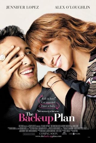
The Terrible: Terrible movie, terrible poster. JLo’s comeback is a horrible piece of crap right the way down to its marketing.
Worst Detail: Just because you cover Alex’s face, JLo, it doesn’t mean he won’t realise he’s in a horrible romcom with you. Just look at his strained smile. He blatantly despises you.
Next: Iron Man 2 [page-break]
Iron Man 2
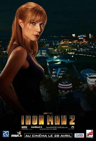
The Terrible: Gwynie stands enigmatically with Stark Industries in the background. Photoshopped in, of course.
Worst Detail: Lollipop head! Gwynie clearly hadn’t eaten much that day – her entire body has wasted away to practically nothing. Get this woman a cheeseburger, pronto.
Next: Sex And The City 2 [page-break]
Sex And The City 2
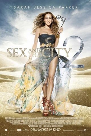
The Terrible: A gawdy mess, just like the movie. Why is SJP wearing horse reins for shoes?
Worst Detail: The entire thing is just atrocious, we can’t single out anything in particular that doesn’t offend us anymore than anything else. The glitter dandruff comes close, though.
Next: Knight And Day [page-break]
Knight And Day
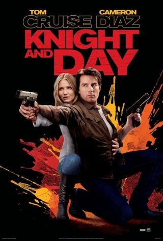
The Terrible: Blatant attempt to make Tom Cruise look taller than Diaz. Look how much straighter his back is than hers.
Worst Detail: Cameron Diaz’s head has been superglued onto somebody else’s body!
Next: Clash Of The Titans [page-break]
Clash Of The Titans
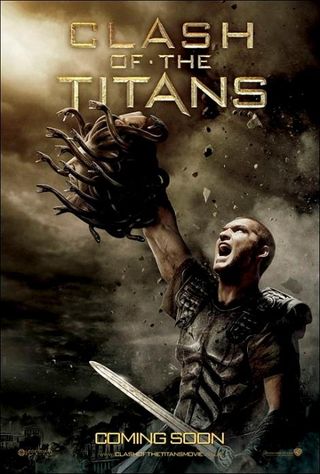
The Terrible: Goes for moody, ends up muddy. War cries are so last century.
Worst Detail: Why is Sam Worthington holding a picture of Medusa? Oh, that’s the special effects? We’ll pipe down now.
Next: Bounty Hunter [page-break]
Bounty Hunter
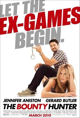
The Terrible: Photoshop goes crazy – they don’t even pretend that Butler and Aniston were in the same room for this pose.
Worst Detail: Just where is midget Butler sitting? It looks like he’s resting on Aniston’s plump derrière, but surely she wouldn’t look that comfortable if he was?
Next: Vampires Suck [page-break]
Vampires Suck
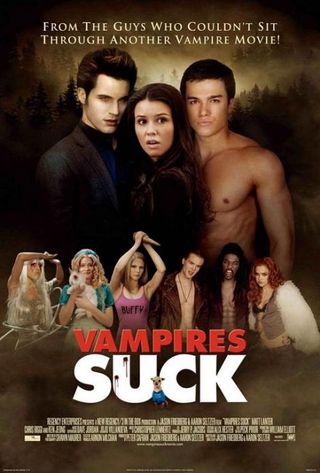
The Terrible: This movie just refuses to die! And it’s awfulness extends to its artwork, a lame rip-off of New Moon ’s promotional material.
Worst Detail: The god-awful mini-snaps of Lady Gaga, Buffy and the ‘Black-Eyed Peas’. You think that’s going to entice us into theatres?
Next: Extraordinary Measures [page-break]
Extraordinary Measures

The Terrible: Brendan Fraser and Harrison Ford descend into movie hell – they can’t even look at each other, they’re so disappointed in themselves.
Worst Detail: Lazy craftsmanship – that body blur is just plain odd.
Next: Gulliver's Travels [page-break]
Gulliver’s Travels
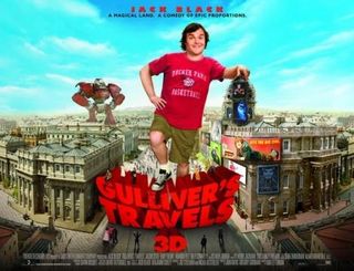
The Terrible: Photographer: “Here, Jack, stand in front of this green screen, lean on this green box and smile like a nerdy.” Jack: “Okay.”
Worst Detail: A horrible recreation of a miniature city, with kid-baiting bits cynically added in – want Transformers in Gulliver’s Travels? You got em!
Next: I Love You Phillip Morris [page-break]
I Love You Phillip Morris
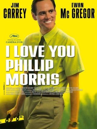
The Terrible: It goes for fresh lemony goodness, but gets mouldy left-over lime. Bad fruit bowl.
Worst Detail: Just ‘cos you took a still from the film, stripped it of context and gave it a coloured blush, it doesn’t mean you’ve got a good poster on your hands. Boring.
Next: Afterlife [page-break]
Afterlife
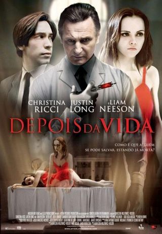
The Terrible: All of it. From the dreadful photoshopping to the general composition. Look how peeved Ricci is with it all.
Worst Detail: Er, what’s happened to Liam Neeson’s face? He looks like a weird fox monster.
Next: The Expendables [page-break]
The Expendables

The Terrible: Was this before Mickey Rourke headed off to the surgeon for his latest nip and tuck? Or is that fire so hot it’s started to melt him?
Worst Detail: Wait, he’s blatantly not even there is he? That’s just an Iron Man 2 still pasted onto some cowboy’s body. Lame.
Next: Saw 3D [page-break]
Saw 3D

The Terrible: Brings a whole new meaning to ‘milky eye’.
Worst Detail: We just don’t get this one. Sure, the manipulation on the eyeball fluid is fun, but it just looks like a very odd Japanese advert for soya-free goods.
Next: Knight And Day... Again [page-break]
Knight And Day… Again
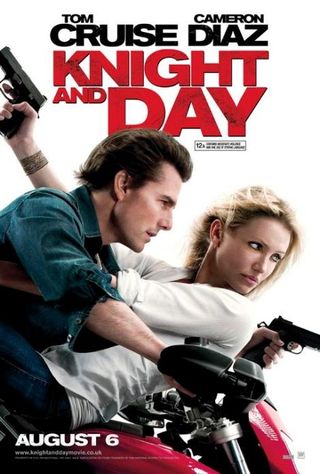
The Terrible: Seriously, how many terrible posters can one film have? No wonder nobody went to this piece of rubbish.
Worst Detail: A recreation of the film’s only half-decent scene, but horribly airbrushed. Badness.
Next: The Last Airbender [page-break]
The Last Airbender
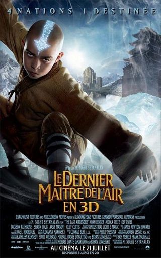
The Terrible: The worst movie of the year gets a poster that appears to have somehow melded a movie image with a road traffic sign.
Worst Detail: He’s concentrating so hard because he’s brewing a big one. That’s our professional anaylsis.
Next: My Girlfriend's Boyfriend [page-break]
My Girlfriend’s Boyfriend
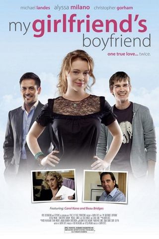
The Terrible: Has anybody even heard of this film? Judging by the poster, nobody was expected to.
Worst Detail: It reeks of made-by-crummy-TV-talent, from that cast, to the desperate addition of has-beens Carol Kane and Beau Bridges. Amateur.
Next: Takers [page-break]
Takers
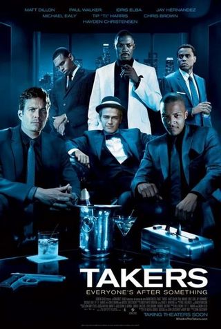
The Terrible: Clearly this cast just couldn’t bear to be in the same room again to pose for a poster, which accounts for all the terrible photoshopping.
Worst Detail: Hayden Christensen, as usual. Was that a last-minute shot taken from his webcam and then just pasted onto the poster? Looks like it.
Next: Yogi Bear [page-break]
Yogi Bear
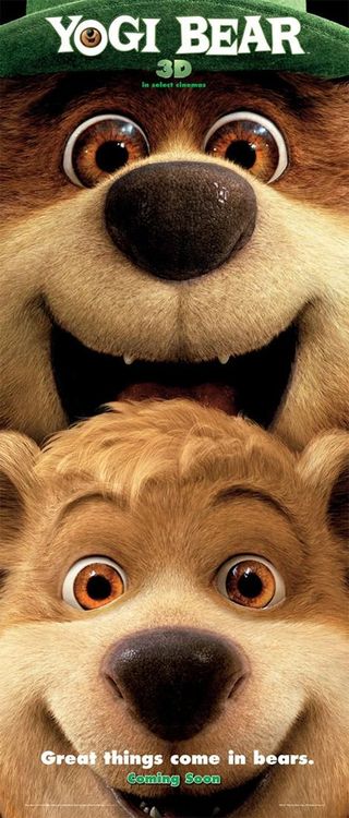
The Terrible: It’s from the Yogi Bear movie, of course it’s terrible.
Worst Detail: Did they really mean to do that? ‘Good things come in bears,' with a distinctly suggestive image of very happy looking Yogi and Boo-Boo? They must have. In which case it's genius. But still terrible.
Next: And Then Came Love [page-break]
And Then Came Love
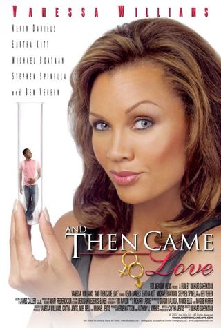
The Terrible: Vanessa Williams finds love – problem is, the chap’s only the size of a test tube. Ah, well, what in life is perfect, eh?
Worst Detail: Is this a remake of the 50 Foot Woman? That’s what the poster’s telling us.
Next: Just Wright [page-break]
Just Wright
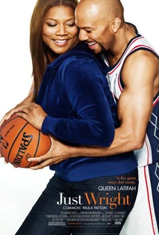
The Terrible: Just wrong. Common wrestles Queen Latifah for a basketball. Is that meant to signify something?
Worst Detail: Why is Latifah smiling so much? Something tells us there's something else afoot here…
Next: Dinner For Schmucks [page-break]
Dinner For Schmucks
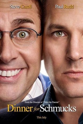
The Terrible: Steve Carell and Paul Rudd seem to have been messing with the super glue, meaning the poster for their movie warranted them being scarily up close and personal.
Worst Detail: Carell’s teeth! They’re blinding! And so big! They’re going to put our eyes out! Too late…
Next: The King's Speech [page-break]
The King’s Speech
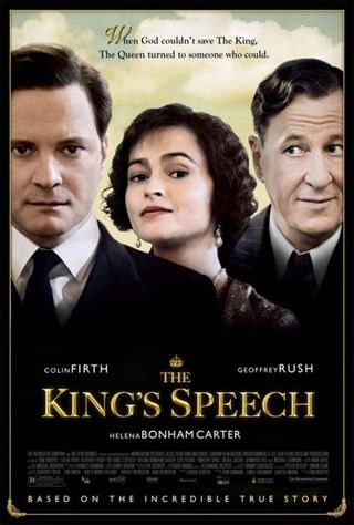
The Terrible: Gah, more photoshopping maladies. Whoever birthed this botched disaster hasn’t a clue about shading or positioning. A shame, we hear the film’s alright.
Worst Detail: What's with all the raised eyebrows?
Next: Dream Boy [page-break]
Dream Boy
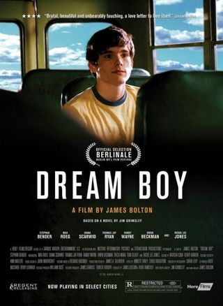
The Terrible: Yeah, yeah, we get the title’s insinuating a dreamy landscape and all that, but this is just horrible.
Worst Detail: The blue sky background is completely Sesame Street, and has nothing to do with the film whatsoever. At least that Berlinale logo is nice and big.
Next: Boogie Woogie [page-break]
Boogie Woogie
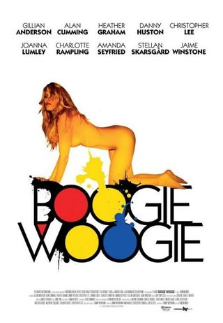
The Terrible: Colour schemes gone mad, as this poster aims for a simple, elegant look. Fails spectacularly.
Worst Detail: That naked woman appears to have just survived an encounter with Goldfinger...
Josh Winning has worn a lot of hats over the years. Contributing Editor at Total Film, writer for SFX, and senior film writer at the Radio Times. Josh has also penned a novel about mysteries and monsters, is the co-host of a movie podcast, and has a library of pretty phenomenal stories from visiting some of the biggest TV and film sets in the world. He would also like you to know that he "lives for cat videos..." Don't we all, Josh. Don't we all.
