15 Greatest Cannes Movie Posters
Capturing la Croisette
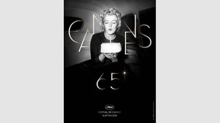
2012
The Poster: Cannes celebrates its 65th anniversary with this gorgeous monochrome image of Marilyn Monroe and a birthday cake. Nothing says "old-school Hollywood glamour" than an image of the ultimate starlet at her most radiant...
Nicest Detail: Pursed lips, golden curls, flawless skin… we'd say Marilyn herself is the icing on this particular cake!
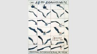
1987
The Poster: The festival commemorates its 40th anniversary with this original illustration from the artist, Cueco. Selecting an image of a seagull to represent a star-studded film festival perfectly sums up the esoteric nature of Cannes.
Nicest Detail: The choice of a seagull is nicely evocative of the festival's seaside setting. If it were held in Britain, we could recreate the poster by subbing in a pigeon…
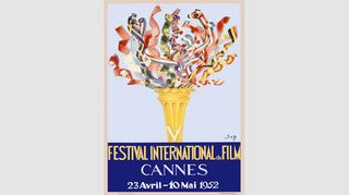
1952
The Poster: Jean Don plays up the festival's international element with his official illustration for the 1952 festival. Can you spot the Union Jack in there, Wally watchers? Literally seconds of fun!
Nicest Detail: The concept as a whole. Many of the official posters focus on the gallic nature of the festival, but this one acknowledges the contribution of filmmakers from every corner of the globe.
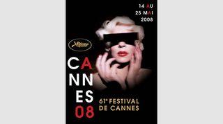
2008
The Poster: Inspired by a photograph by the great David Lynch, Pierre Collier's 2008 effort is disconcerting and glamorous in equal measure. Creepily beautiful, much like the majority of Lynch's body of work.
Nicest Detail: The blood-red lettering, mirrored by the model's choice of nail-polish and lipstick. Lovely coordination there…
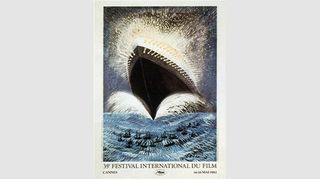
1982
The Poster: While it might look like early concept art for Titanic , this 1982 poster was actually adapted from an original drawing from the great Federico Fellini. See, there is a filmmaking link in there somewhere...
Nicest Detail: The brilliant lights, crashing waves and illuminated spray lend the ship an almost celestial quality. No iceberg is bringing this old girl to her knees…
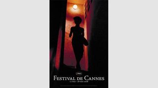
2006
The Poster: The 2006 poster takes its cues from an image from Wong Kar Wai's In The Mood For Love . The film was nominated for the Palme d'Or six years previously, eventually missing out to Lars von Trier's Dancer In The Dark .
Nicest Detail: The orange glow illuminating the backdrop manages the considerable feat of making a largely blacked-out image seem warm and inviting.
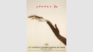
1990
The Poster: Typically wistful Cannes fare, as a hand grasps a palm frond in this lovely soft-focus effort from illustrator Castella Traquandi. Subtler than scrawling "ARTHOUSE" in capital letters, but only just…
Nicest Detail: The offhand scrawl announcing "Cannes 90" is a welcome antidote to the stuffier full title at the bottom of the poster.
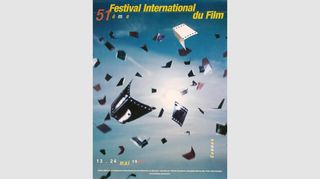
1998
The Poster: A flurry of celluloid snippets fill the air like a flock of birds. Or even butterflies. Either way, they look very nice, don't they?
Nicest Detail: The hazy sunshine filtering through the image makes us wish we were sipping a cold lager somewhere on la Croisette. Pure escapism.
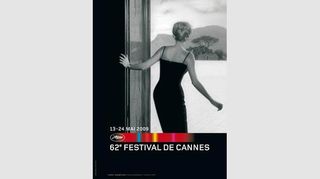
2009
The Poster: Annick Durban's 2009 beauty adapts a still from Antonioni's L'Avventura , in which Monica Vitti stares out at a gorgeous expanse of water. The film was actually booed at its Cannes unveiling, so perhaps this is the festival's way of making amends…
Nicest Detail: Vitti's awe-struck pose mirrors the way the best cinema leaves its audience open-mouthed with wonder.
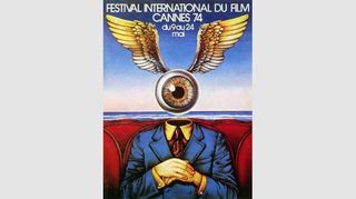
1974
The Poster: Georges Lacroix scores top marks for madness, with this surreal offering in 1974. What's weird about a winged eyeball taking in the latest cutting-edge cinema?
Nicest Detail: Pairing a red and black striped tie with a bright yellow shirt is a bold move, to say the least…
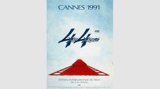
1991
The Poster: Philippe and Pascal Lemoine conjured up the artwork for the 44th festival, combining a strip of celluloid with the red carpets that abound la Croisette in May.
Nicest Detail: We like the way they've incorporated the famous palm leaves into the "44". Nice touch.
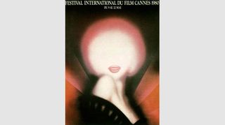
1980
The Poster: Another Cannes poster to pay tribute to Marilyn Monroe, despite the fact she never once attended the festival. Michel Landi's image capitalises on the idea of Monroe as the brightest burning star in the Hollywood constellation.
Nicest Detail: The combination of raised shoulder and playful smile ensure the image couldn't be mistaken for anybody else. Masterful stuff.
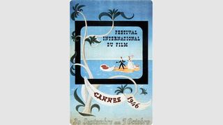
1946
The Poster: The inaugural festival is accompanied by a poster encapsulating everything that's great about Cannes: the sun, the sea, the boating trips to miniature sandbanks… all the classics, basically.
Nicest Detail: The fact that the poster wilfully eschews any attempt to actually advertise the film element of the festival. How very French...
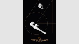
2011
The Poster: A retro image of Faye Dunaway, supplying a touch of old-fashioned Hollywood glitz to last year's festival. It looks a bit like the cover of an Adele album, but we won't hold that against it.
Nicest Detail: The black and gold colour scheme oozes class. We learned that from a recent episode of The Apprentice …
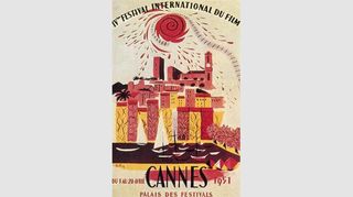
1951
The Poster: A.M. Rodicq uses a host of rich, warm colours to capture the Cannes' sun-kissed allure, seemingly oblivious to the fact the festival takes place in spring rather than autumn. Still, it certainly makes for an enticing scene…
Nicest Detail: The sun, which appears to be moulting shreds of celluloid upon the lucky festivalgoers below. Happens every year...

George was once GamesRadar's resident movie news person, based out of London. He understands that all men must die, but he'd rather not think about it. But now he's working at Stylist Magazine.
Most Popular


