14 golden rules for making LittleBigPlanet levels
The must-know expertise you can't afford to miss
You can do anything in LBP. Which is a pretty daunting prospect. Trying to compete or stand out in the canvas crowd might seem impossible but there are a few simple rules you can follow to increase the chances of your work getting noticed, played and hearted.
This isn't a creation guide - the in-game tutorials do a good job of explaining how everything works. Instead, these are a few vital guidelines to make sure you build smarter and better while making your levels more fun to play. Your rise to tiny fabric-based power begins here.
1) Never make it up as you go along

There's nothing wrong with messing about and experimenting. It's a good way to learn. However, try to create a finished level with no concrete plan and you'll end up with an amateurish result.
Sketch out a few ideas first. It doesn't have to be an architectural schematic, just a rough doodle to decide what's going where. What shape is your level? Where are the hazards going? It's vital to think about this if you want to get the pacing and space requirements spot on - you don't want all the good stuff crammed in one spot while tumbleweeds blow through the rest of your creation.
The more effort you put into designing a level before you start building then the easier it'll be to create, and the better the final result.
2) Have a theme
Sign up to the 12DOVE Newsletter
Weekly digests, tales from the communities you love, and more

Anyone can build a few platforms, scatter a few spikes and call it a day. What will really make your creation sing is a sense of visual unity. It'll feel far more approachable than a messy collection of random stickers and objects. Are you in a jungle? Space? A carpark? Just a few design ideas will help bring everything together and create a more professional finish.
Varied use of colour and lighting will also help break things up. Mix up dark and light, or open spaces with claustrophobic tunnels, to create the illusion of different areas and zones This will add variety, draw people on to see what's next and keep them playing.
3) Tell people what to do

So you've spent months designing, playing and testing your level. You publish it and everyone gets lost, stuck and savages you with poor feedback. Why? Partly because people are idiots but mostly because they don't know what goes on in your head.
Of course you think a route, puzzle or challenge is obvious after hundreds of hours working on it. But to everyone else your world is a strange and mysterious place. The easiest way to guide people is with arrows. It's crude, though, so if you'd rather be more subtle and get all Derren Brown you can play with people's minds instead.
The easiest way to do this is with light. People are like moths and a well placed patch of illumination will draw them in without being obvious. You can do the same with colour, lightening the tone to lead people on. Score bubbles are also useful as a breadcrumb trail to make people go where you want.
4) Reward people
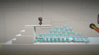
Players might admire your artistic design, your creative flare or clever use of spring-loaded penis platforms. What they really want, though, is to win. So give people plenty of score bubbles. Don't scatter a few around like hotel pillow mints. Leave huge piles, or long combo-tastic runs to rack up huge numbers. It's a simple trick but the more you reward someone the happier they'll be.
